McDonald’s Monopoly 2025:
Special Edition
The McDonald’s Monopoly campaign is a long running promotional collaboration between McDonald’s and the board game Monopoly, this year’s theme was The Special Edition. It transformed the promotion into an immersive 3D world, where users could race around a Monopoly board for the chance to win exciting prizes. The experience featured a mix of 3D assets, from animated characters to dynamic buildings, trains, and clouds, creating a playful, gamified environment. To balance this, we brought back the classic 2D vintage Monopoly style in our UI design. The mix of both made the experience fun, and full of colours. We focused on making every button, animation, and interaction feel part of the game, creating a super dynamic experience that captured the excitement of racing around the board.
Project Type:
Strategies:
- UI Design
- Prototyping
- Usability Testing
Timeline:
Tools Used:









Introduction
McDonald’s campaign?
- McDonald’s Monopoly 2025 : Special Edition
Evaluation
- Aesthetic & UX research
Research
- Overall UI visual exploration
- Our chosen aesthetic: 2D Gameboard
- Full design phase
The Final Product
- Icons & Buttons
- Design & Visual elements
- Screens
- Demo
Testing
- Staging testing app & Jira
- Workshop
Results
- Media and press feedback
Introduction

Overview
I had the privilege of working as a Junior UI Designer on this campaign project for McDonald’s. As a UI team, our process typically begins with building knowledge and understanding the context of the year’s theme. So, I’ll start by providing some background on the long running McDonald’s Monopoly campaign, along with the theme and key features of its 2025 iteration.
What is Monopoly x McDonald’s campaign?
The Monopoly x McDonald’s campaign is a long running promotional collaboration between McDonald’s and the board game Monopoly that turns everyday food purchases into a gamified experience. Customers receive game pieces usually stickers attached to menu items that correspond to properties on the Monopoly board. By collecting complete sets (like all properties of a colour group) or finding rare pieces, customers can win prizes ranging from free food to large cash rewards or even cars. The campaign works by blending chance, collection, and instant rewards, encouraging repeat purchases as people try to complete sets or uncover high value prizes.
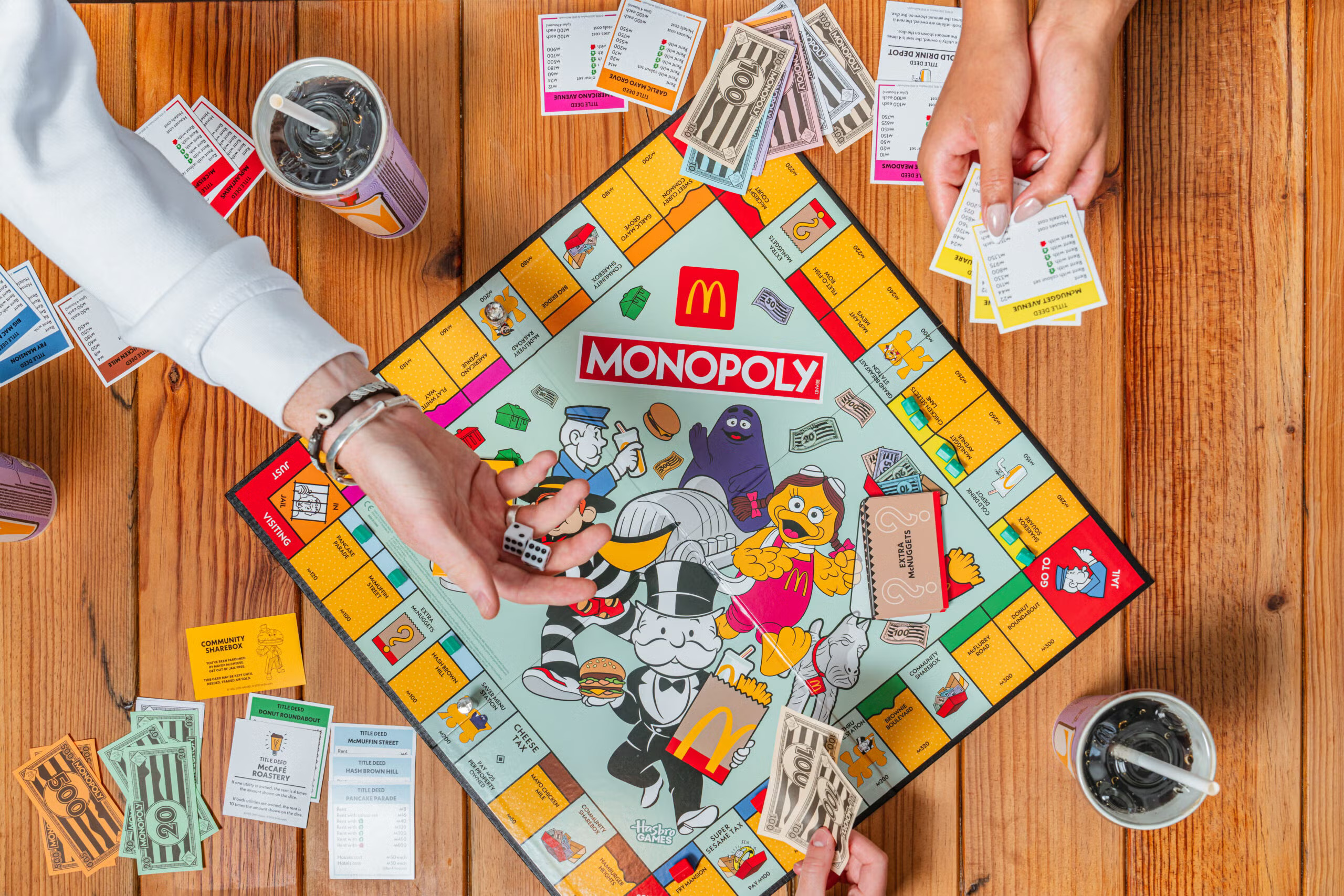
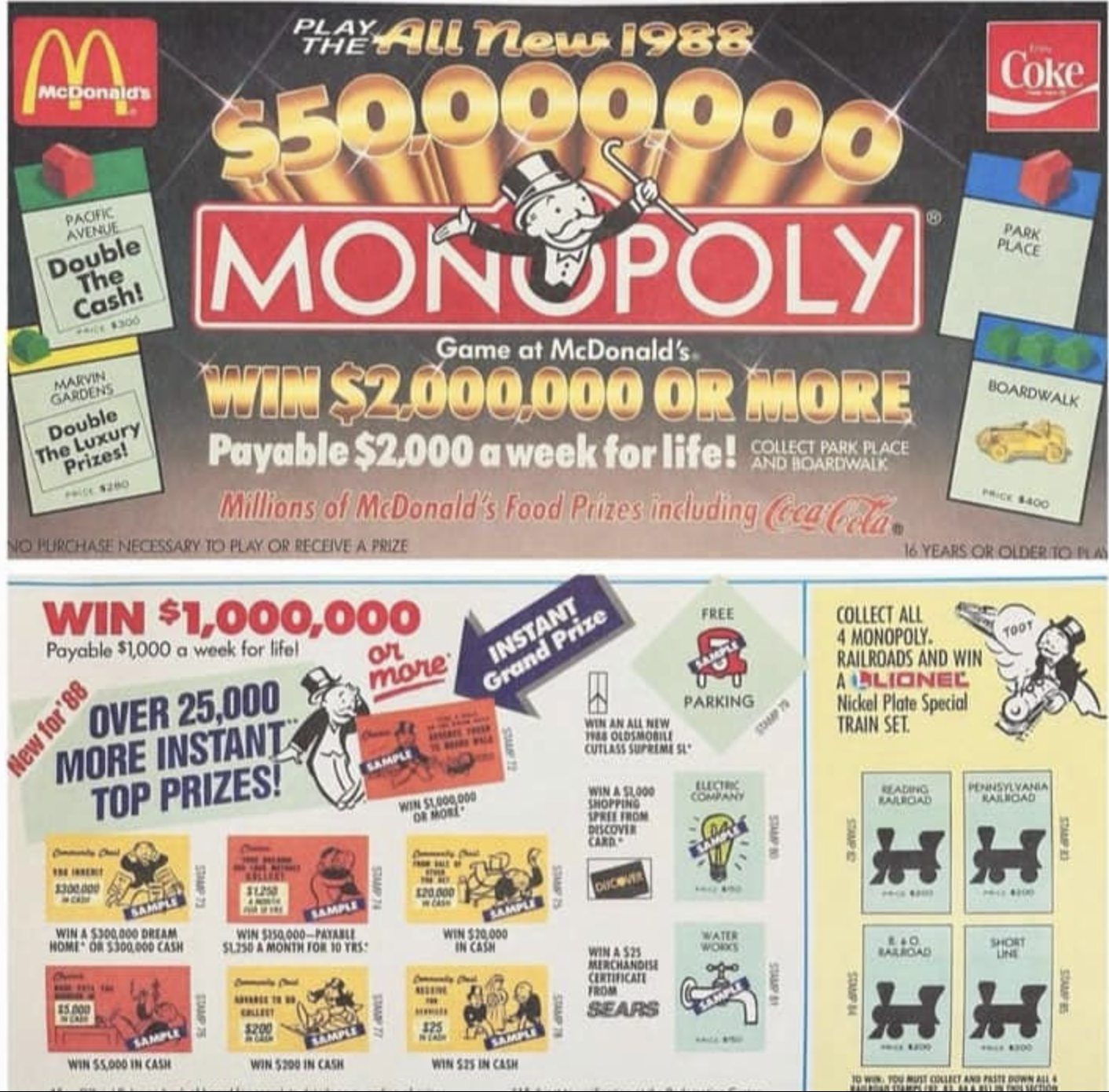
1987 - McDonald's X Monopoly launched in the US
The campaign began in 1987. The game allowed customers to peel off game pieces attached to fast food packaging to collect Monopoly properties or win instant prizes. During its early years, the game was completely paper based.
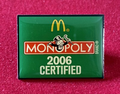
2006 - Introduction to the UK Market
McDonald's and Monopoly then brought the campaign to the UK in 2006, mirroring the concept of the US game with instant prizes and collectible properties that could be redeemed for larger prizes.
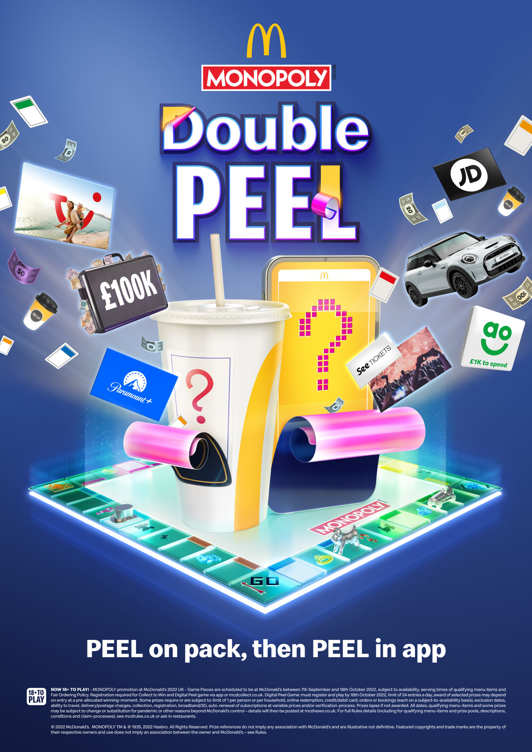
2022 - Digitalised game
With the widespread adoption of smartphones, McDonald's saw an opportunity to create a more immersive and engaging experience by digitalising the Monopoly game. TMS was the company that led the first ever digital McDonald's Monopoly campaign and has been involved in every campaign since.
McDonald’s Monopoly 2025 : Special Edition
The 2025 edition of the McDonald's x Monopoly campaign centred around a bold new "Special Edition" relaunch. The campaign stripped back the traditional Monopoly experience and repositioned it as the ultimate collaboration, introducing a range of exciting new features to generate hype and encourage participation. The main concept was to involve the campaign in the hype and limited collab culture that has been bubbling up in recent years. So the campaign included exclusive collaboration prizes, limited edition merchandise, the first ever Monopoly limited time offer, and much more. As the most playful McDonald's Monopoly campaign to date, the goal was to inspire customers to play for the chance to win something truly special.
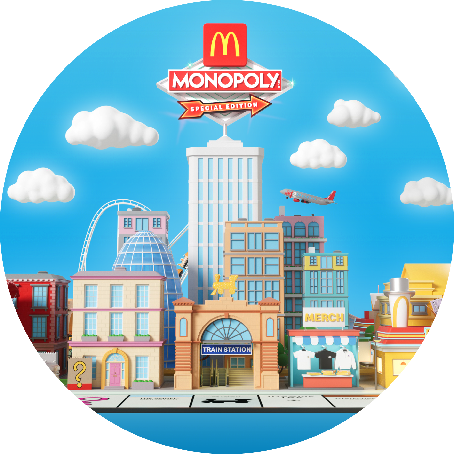
This campaign main concept surrounds a Topia inspired 3D world built within a Monopoly game board, showcasing prize partners and signature collaboration assets. A digital gameboard was added to showcased prize partners in a joyful and surprising ways and it was used within the digital experience to bring the prize pool to life and excite customers with what they could win.
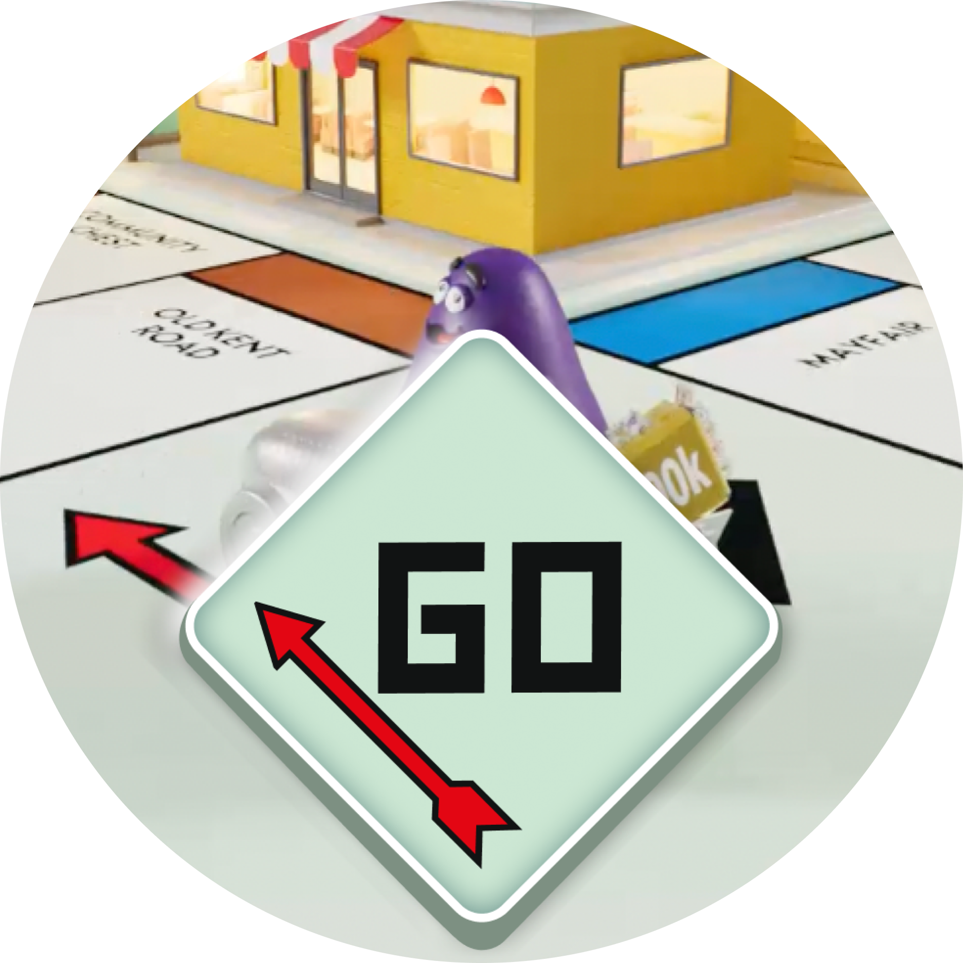
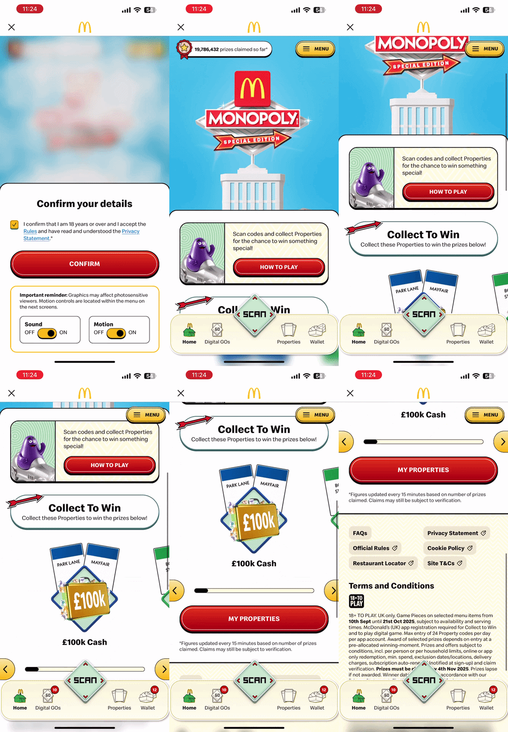
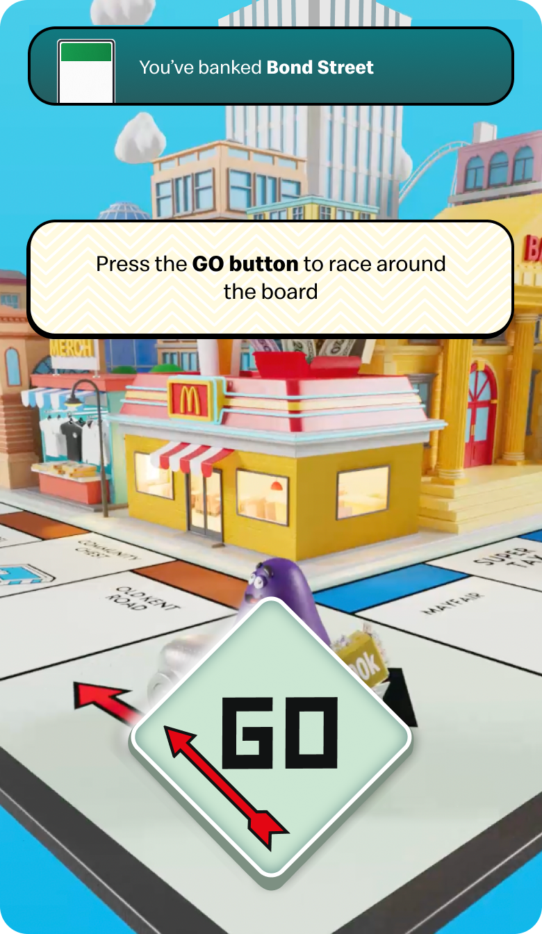
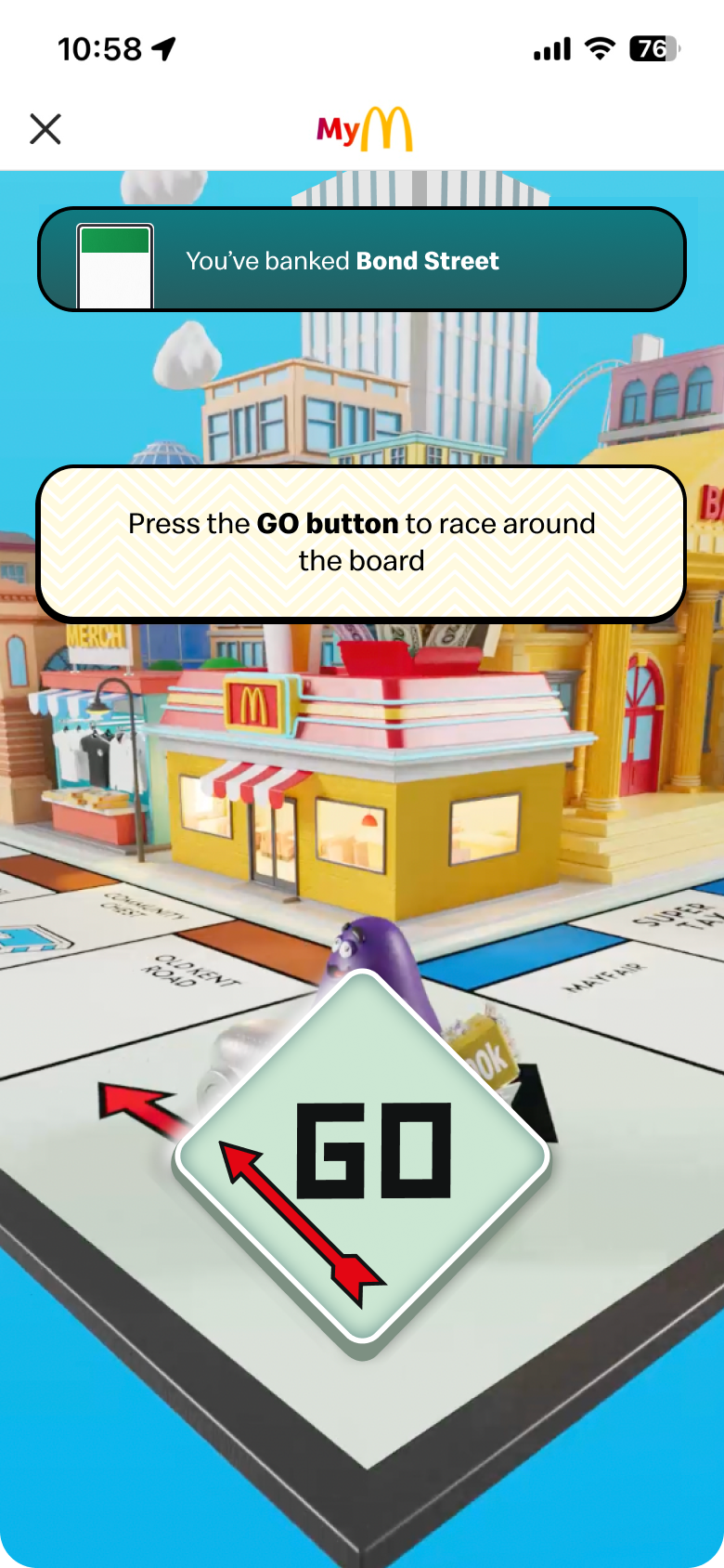
The Digital Peel from the last campaign was replaced the with the irresistible GO button, for our most immersive gameplay yet. After the physical peel, customers press GO in the app to race around a 3D gameboard, landing on a tile to bank a property or prize.
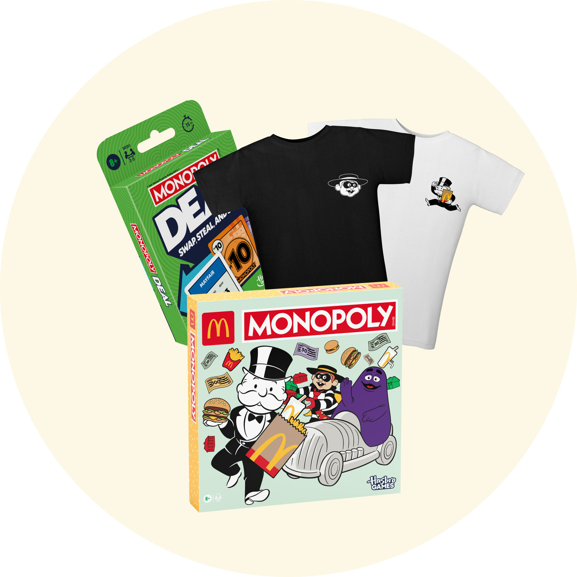
Collab items were involved in the prize pool such as McDonald’s Monopoly gameboards, curated experiences, and merch.
Evaluation
%202.png)
Overview
We then move into the evaluation phase, where we review the previous year's challenges and create the creative foundation for the campaign's UI.
UI Challenges in the 2024 Campaign
Our process as a team usually begins by evaluating the UI challenges we encountered in the previous year's Monopoly campaign and identifying opportunities to improve them in this year's experience.

Flat Designs and not very dynamic
we felt we didn't make full use of UI elements that could have made the experience feel more dynamic and three dimensional. The designs felt relatively flat and lacked depth.

Lack of Micro-animations
Micro-animations are a great way to enhance the feel of a campaign. Looking back, we could have incorporated more of them to bring the interface to life.

Needed to be more campaign led
We could have incorporated more campaign assets into the UI to create a more campaign focused experience that better aligned with the overall brand promotion.
Proposed Solutions for 2025 campaign
Then, looking at these challenges, we concluded three main solutions to address the UI challenges from last year.

Add components and depth
Incorporating more design cards and components to lift information off the page, creating greater depth and a more modern feel.
More motion and animated elements
Exploring more opportunities to bring the campaign to life through motion and animation, including page transitions, content reveals, and interactive UI elements.

Incorporate more campaign assets
Find opportunities to make greater use of campaign assets, elevating key visuals to build excitement and create a more immersive Monopoly: SE experience.
Changes to the functionality and mechanics
Every Monopoly campaign introduces UX changes to features, functionality, and game mechanics. Below are the key updates for this year's campaign, which shaped how we approached implementing these changes through an engaging UI.
Replace the Digital Peel with GO button

As mentioned, the GO button is now being added so users can move around the digital Monopoly board and enjoy a more immersive Monopoly experience.
Hero Animation
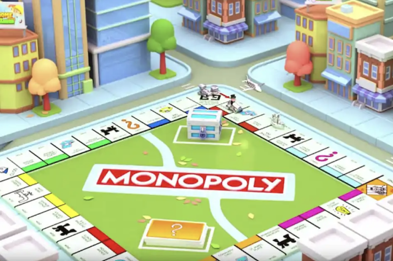
Instead of the digital board game, a hero animation will be placed on top instead, this will link to the game play to pull players into the world of Monopoly Special Edition.
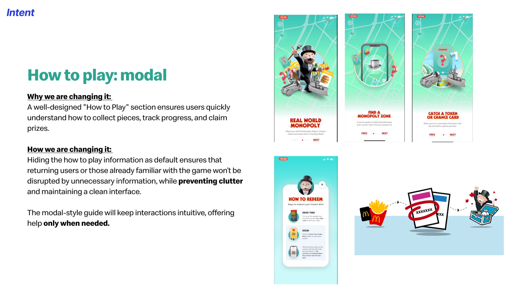
How to Play Module
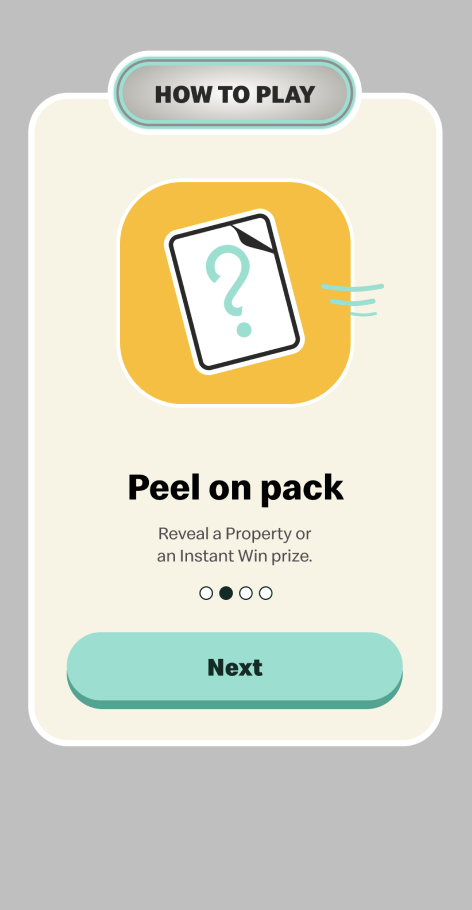
Instead of the permanant placement of the rules of the game on the homepage, a dedicated module will be added to avoid repeating information to returning users.
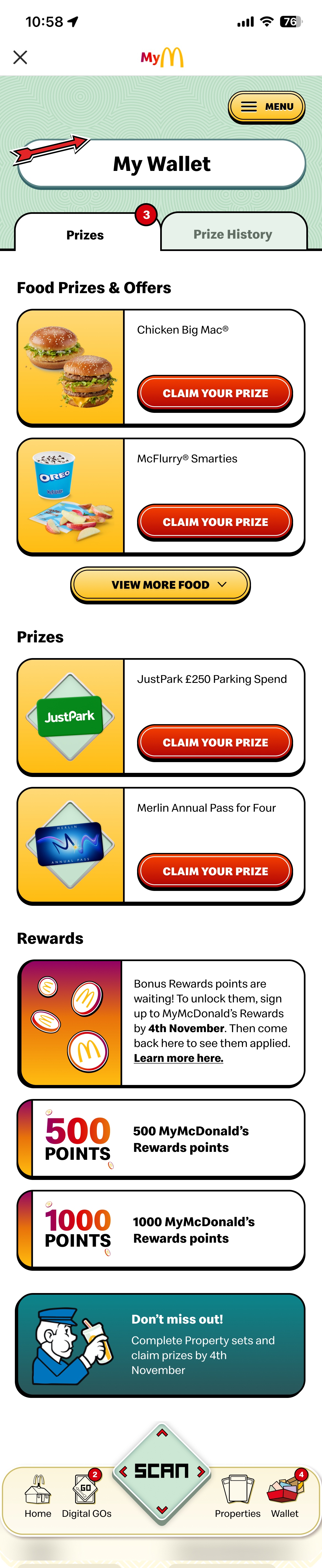
Wallet Tabs
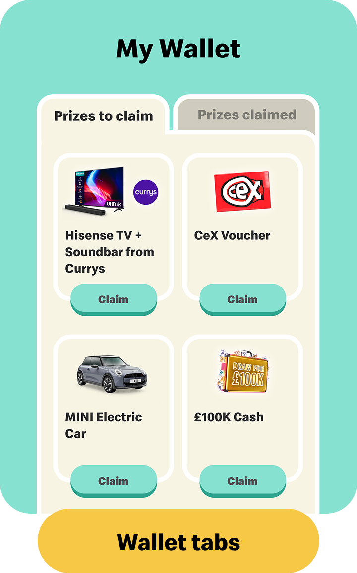
To reduce excessively long pages, UX and UI introduced tabs, allowing us to organise content more efficiently and reduce the amount of information displayed on a single page.
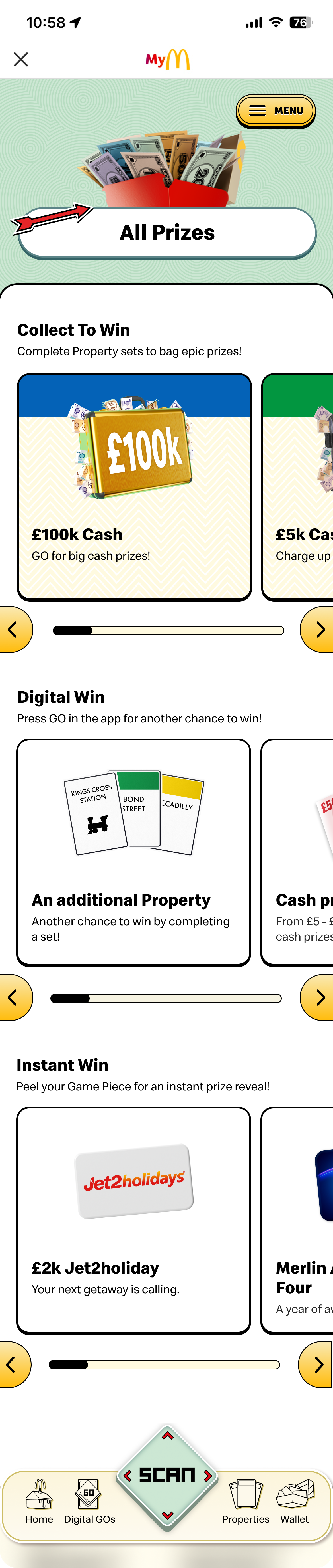
Horizontal Scroll
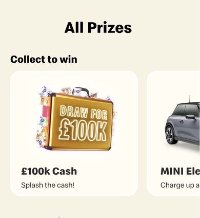
Horizontal scrolling for selected content. This allowed more information to be displayed within the same viewport without overwhelming users, while creating a cleaner.
Sound Bites

Introducing sound effects to reinforce the gamified experience and create a more immersive Monopoly: SE world.
Research and exploration
%202.png)
Overview
After establishing a foundation by defining the key challenges and new features being introduced to the project, we moved into the research and exploration phase. This allowed us to explore the overall UI visual aesthetic, experiment with different design directions, and determine the best ways to execute individual UI elements.
Exploring new UI Elements
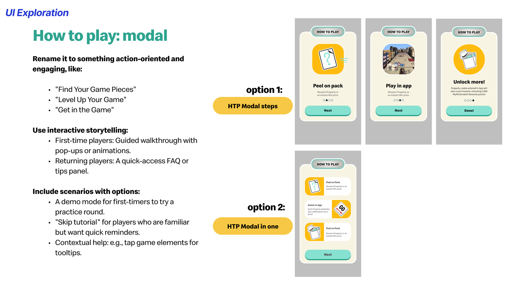
With all of the previously mentioned changes introduced for this year's Monopoly campaign, we took time as a team to explore different approaches for executing each UI element. For example, for the How to Play section, we explored multiple solutions, including a pop-up module with carousel steps, a single information module, or an introductory tutorial that guides users through key elements of the app.We approached this exploration with critical thinking, considering factors such as timing, development capabilities, user preferences, and overall user needs. This helped us evaluate each solution and determine the most effective approach for the final experience.
Overall UI visual exploration
Alongside this, we explored the overall UI visual direction we wanted to pursue. We identified three potential approaches for executing the experience.The first was a 3D World direction, which leaned into the campaign’s bubbly 3D key visuals and created a more playful, mobile game-inspired feel. The second was a 2D Mash Up direction, where we brought in more recognisable Monopoly elements to reflect the campaign’s ultimate collaboration and maintain a connection to the original brand. Lastly, we explored a hybrid 2D / 3D approach that combined elements from both directions to create a balance between the playful digital experience and the classic Monopoly identity.
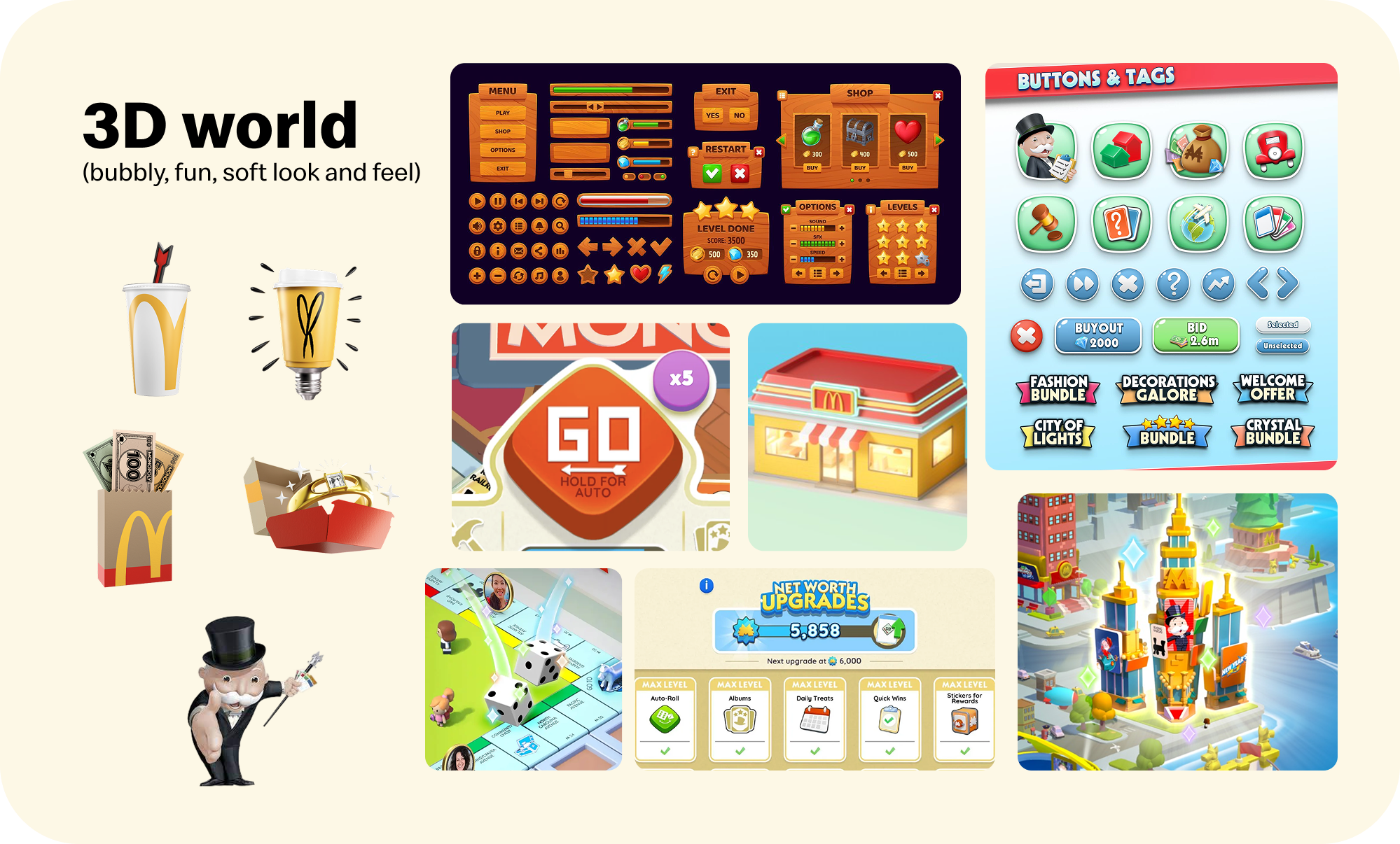
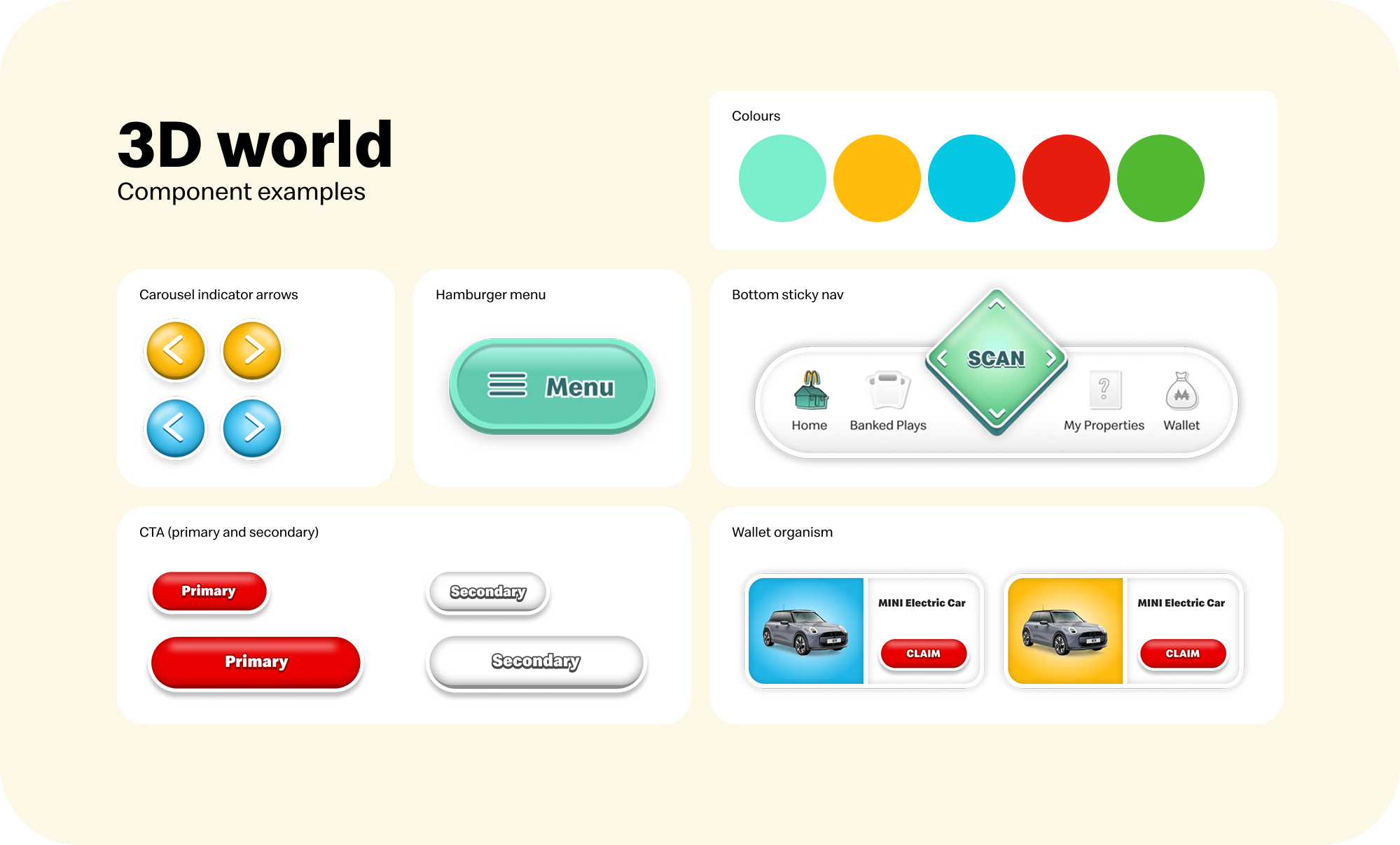
Main feature of 3D World aesthetics
This aesthetic direction focused on amplifying the gamified nature of the Monopoly McDonald’s campaign, drawing inspiration from the campaign’s playful key visuals and 3D assets. The visual language explored vibrant colours, glossy 3D vector elements, and rounded, chunky UI components and typography to create a fun, immersive digital experience.
We could focus solely on the provided 3D assets and, from an interaction perspective, make the app feel more like a casual mobile game UI, similar to experiences like Candy Crush or Monopoly Go.
When discussing this direction with the Creative Directors and amongst ourselves, we identified some potential concerns. The campaign already featured a strong presence of 3D elements, so we questioned whether introducing the same visual language into the UI would add value or feel repetitive. Additionally, without the time or resources to fully transform the app into a game like experience through motion, sound effects, and rich interactions, there was a risk that the UI would feel incomplete. We also questioned whether this direction aligned authentically with the Monopoly brand identity.
Additionally, without the time or resources to fully transform the app into a game-like experience through motion, sound effects, and rich interactions, there was a risk that the UI would feel incomplete. We also questioned whether this direction aligned authentically with the Monopoly brand identity.
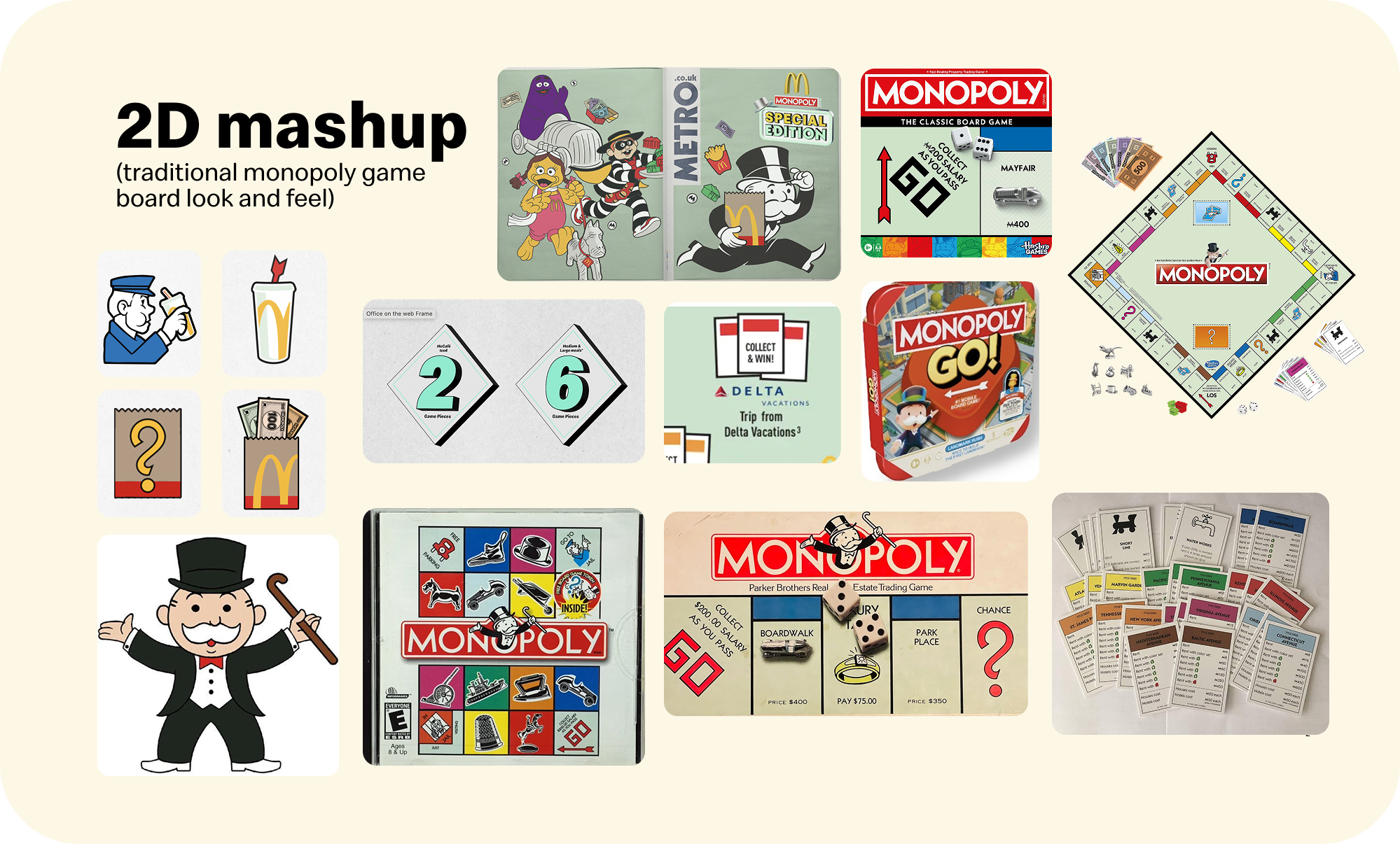
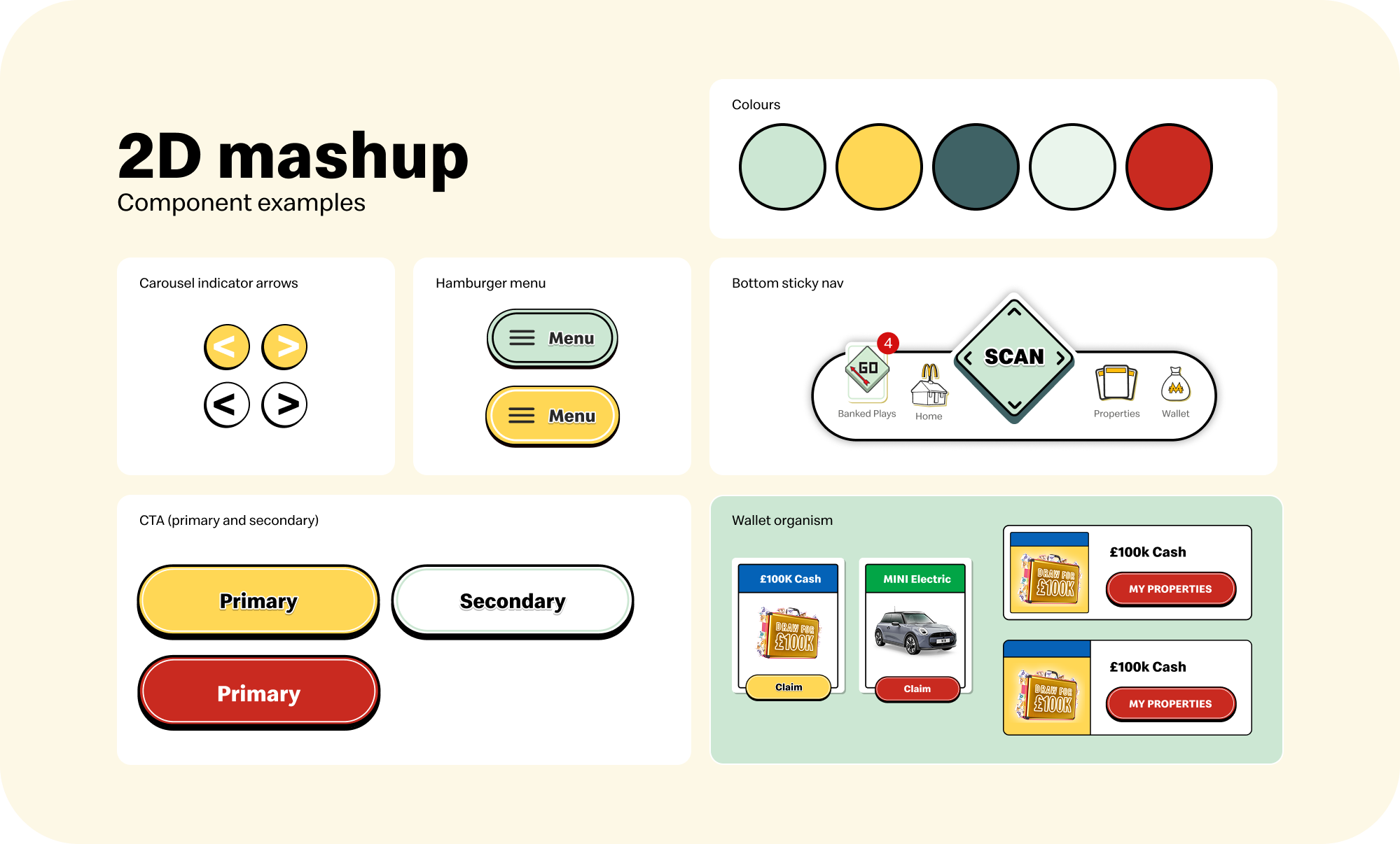
Main feature of 2D Mash up aesthetics
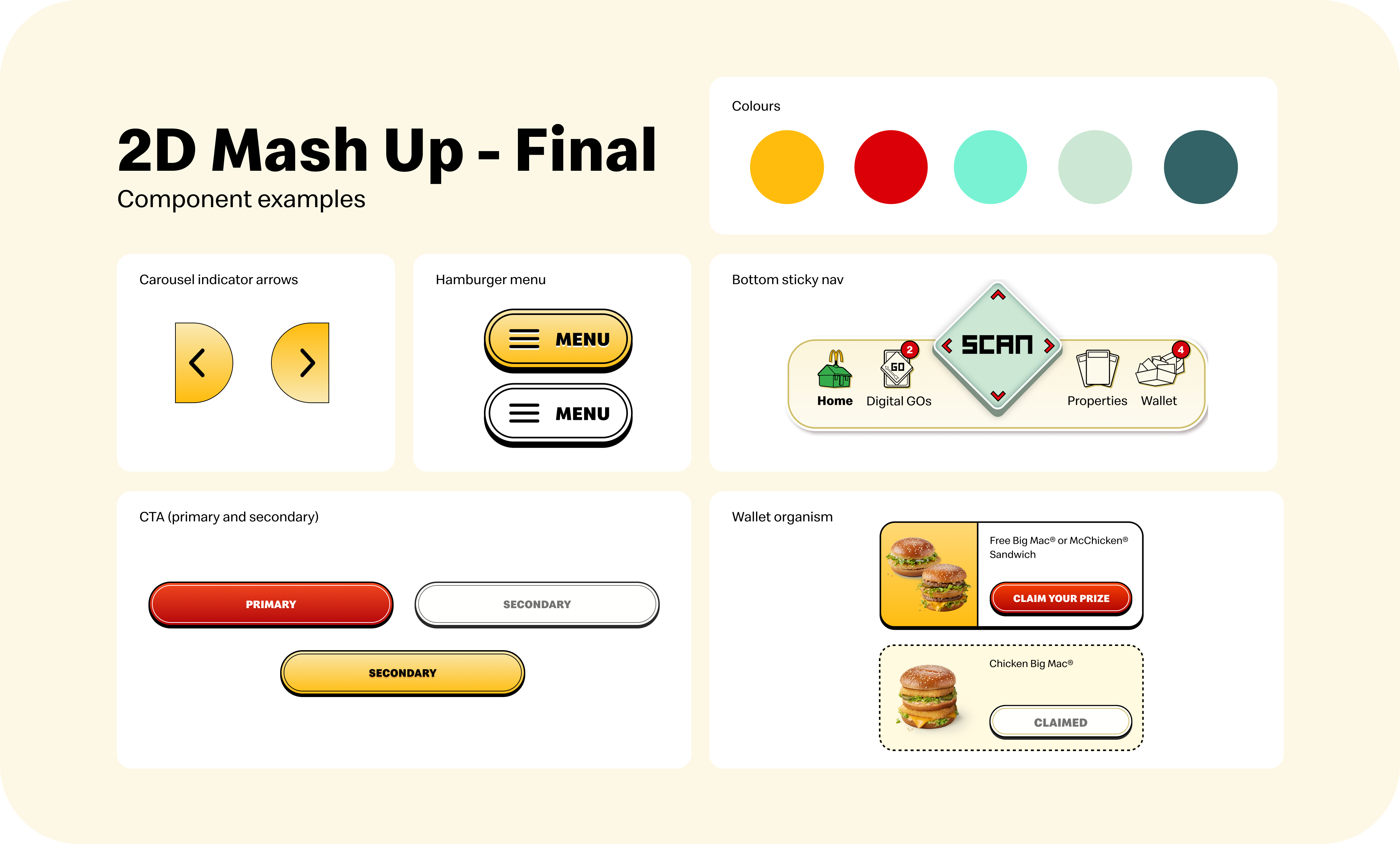
This aesthetic direction drew inspiration from the Monopoly board game, translating elements such as bold stroke lines, card designs, and physical game components into the UI. The visual language explored simpler buttons, solid colours, and familiar design cues to create a cohesive experience rooted in the Monopoly brand.
To reconnect the campaign with Monopoly's original roots, we explored incorporating elements from the physical board game into the UI. This direction focused on using more 2D assets and design elements inspired by the classic game, creating a familiar and authentic experience while reinforcing the Monopoly brand.
One reason not to pursue this direction was that it lacked some of the bubbly visual elements featured in the campaign's key artwork. However, it was also discussed that this could be a strength, as it would introduce greater visual variety and create a clearer distinction between the campaign assets and the UI.
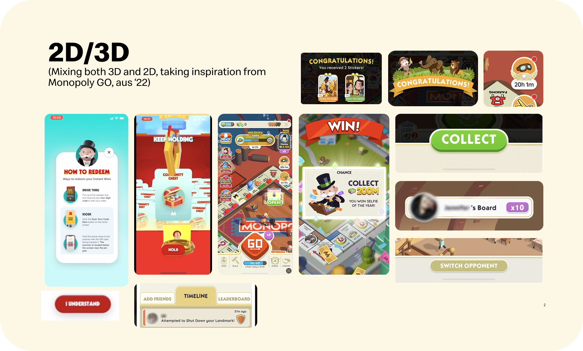
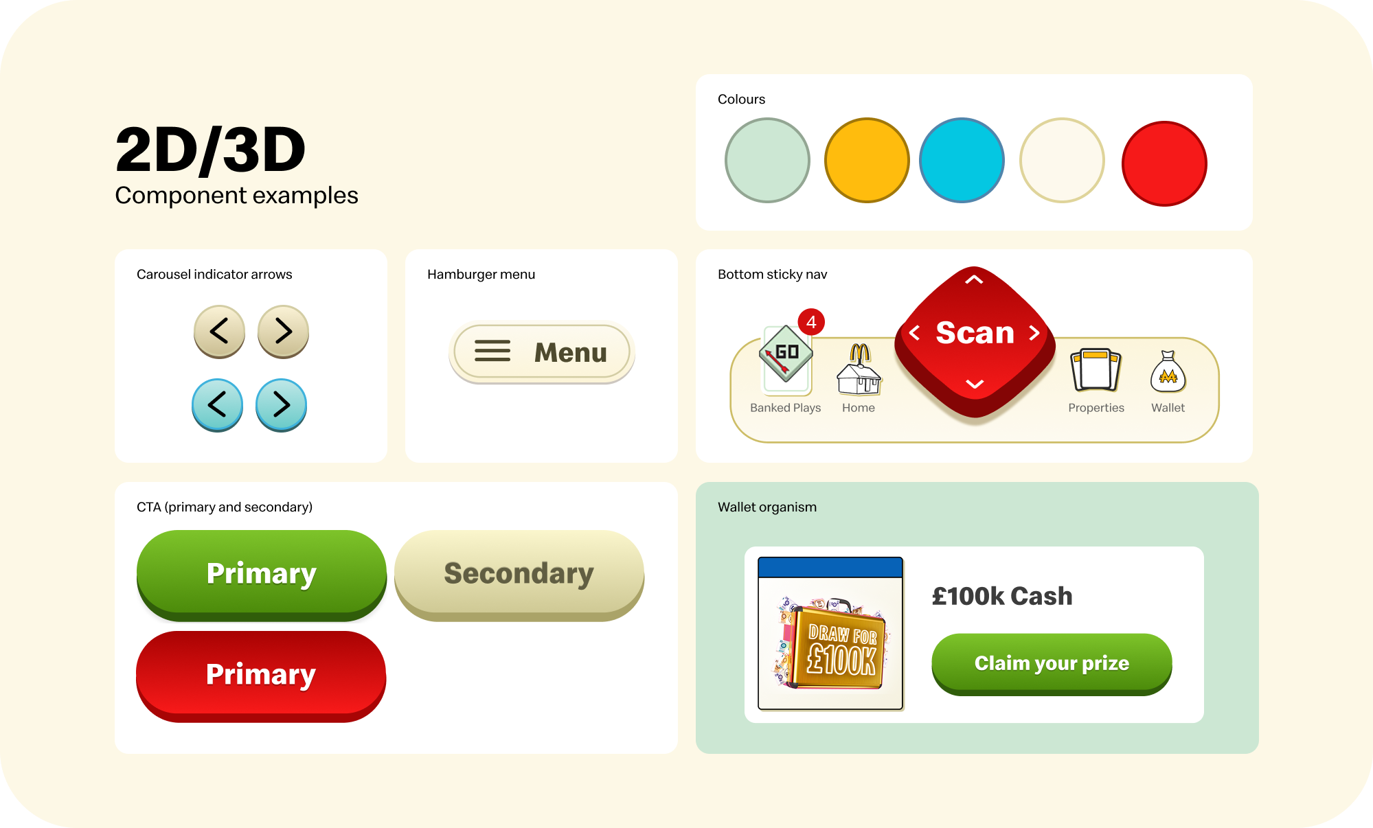
Main feature of 2D/3D aesthetics
This direction combined both 2D and 3D elements to balance the classic Monopoly identity with the campaign's key visuals. The aim was to create a UI that felt recognisably Monopoly while still reflecting the campaign aesthetic. Rather than leaning into a hyper-glossy, game-like style, this approach used a considered mix of 2D and 3D elements to achieve a more balanced and cohesive visual language.
The main discussion surrounding this direction centred on visual cohesion. While combining 2D and 3D elements offered the opportunity to balance the classic Monopoly brand with the campaign's key visuals, some concepts felt inconsistent when viewed together. Certain UI elements appeared to belong to different visual systems, making the overall experience feel less unified. We also considered whether maintaining two distinct styles throughout the product would introduce unnecessary complexity and reduce the clarity of the overall design language.
Our chosen aesthetic: 2D Gameboard
After extensive discussion with the Creative Directors, UI and UX teams, developers, and other stakeholders, we decided to move forward with the 2D Mash-Up direction. One of the key reasons for this decision was that this year's campaign celebrated the ultimate collaboration between McDonald's and Monopoly, bringing together iconic McDonald's characters with Mr. Monopoly. We felt that referencing the original Monopoly board game would reinforce the brand's heritage, creating a more authentic and recognisable experience while complementing the wider campaign.From a development perspective, this direction was also the most achievable. Rather than trying to replicate the feel of a fully interactive mobile game, the 2D approach allowed us to deliver a polished, engaging experience that could be executed within the project's timeline without compromising quality.
With the direction agreed, we refined the visual language through further exploration, experimenting with colour palettes, buttons, and UI components. The final design system was built around solid colours, bold strokes, 2D iconography, and components inspired by classic Monopoly board game elements. This created a cohesive visual identity that balanced the familiarity of the original game with the personality of the McDonald's Monopoly campaign.
Full Design Phase
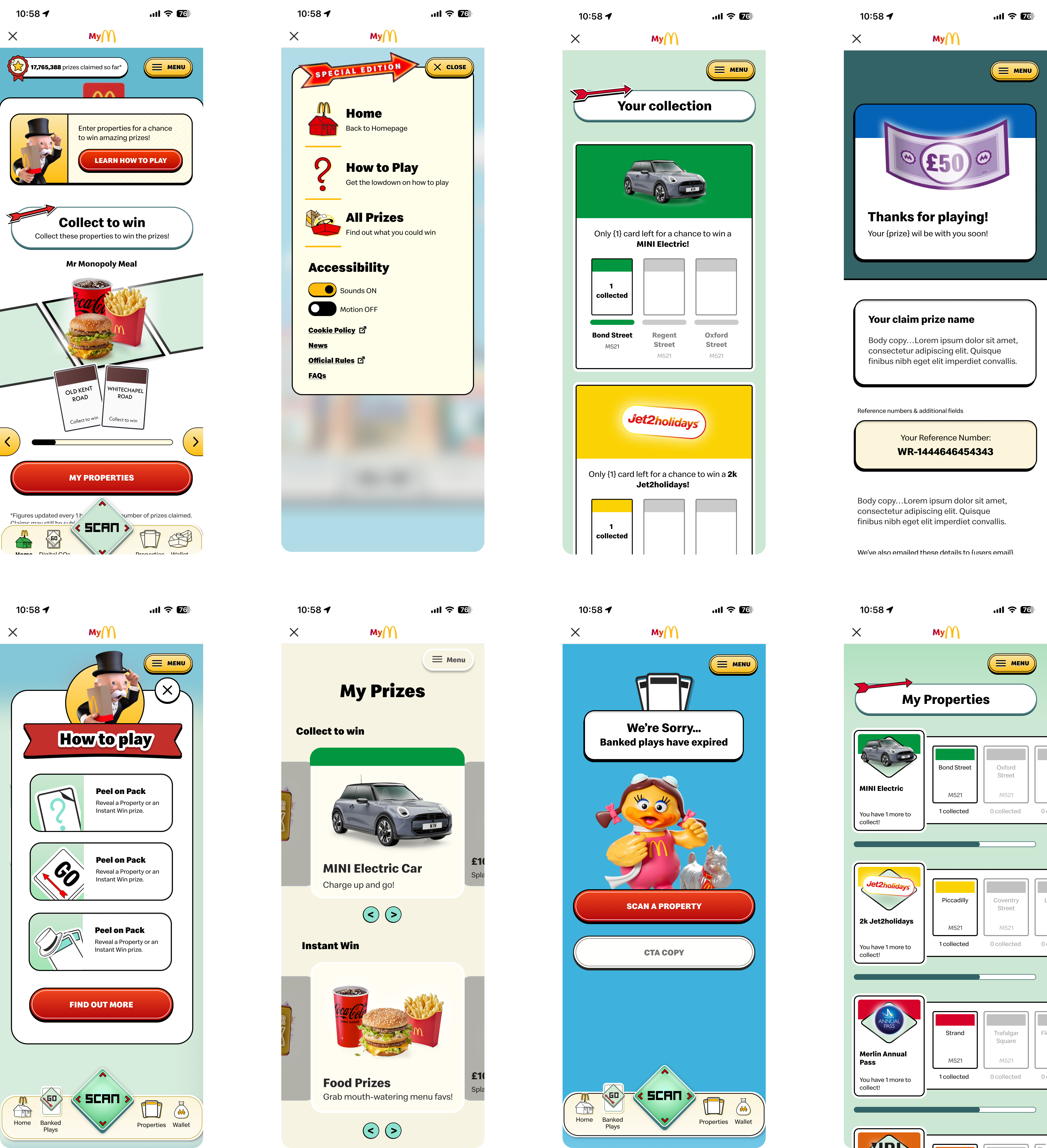
We then moved into the full design phase, where us as a team collaboratively designed all of the required app screens while exploring different UI components, shapes, colour, and layout structures. And just refining ways to rearrange the information needed on the page. Throughout this stage, design decisions were continuously iterated on and discussed, allowing us refine the app and ensure consistency across the experience. This process typically spans around two weeks, resulting in a cohesive design system and page layouts that establish the foundation for the rest of the app. Below are some examples of many of our experimental screens.
The Final Product
%202.png)
Overview
Finally, once the exploration phase is complete and the design direction has been finalised, we produce the finished UI across all screens. The final product is then prepared for handoff to the development team for implementation. Before handoff, we create a component library, organise and structure all design files, and ensure every asset is grouped and documented correctly. This provides developers with everything they need to efficiently build the experience while maintaining consistency with the approved design system.
Colour & Typography

#FFBC0D
.png)
#DB0007
.png)
#79F2D4
.png)
#CCE7D3
.png)
#336366
.png)
#FCDFEB
.png)
#3CC3DD
.png)
#C3B3D7
.png)
#FCB774
Aa
Speedee
Bold
Aa
Speedee
Heading 1 (26 PX)
Heading 2 (20 PX)
Heading 3 (16 PX)
Paragraph 1 (16 PX)
Paragraph 2 (14 PX)
Paragraph 3 (12 PX)
Icons & Buttons
.png)
Station Card
Property Card

Error

On Toggle
.png)
Off Toggle

Account

Left Arrow

Right Arrow

Prizes

Back to top

Close

Swipe up

GO
Collect in-app

Peel on pack

Scan

Home
Digital GOs
Properties

Wallet






.png)
Design & Visual elements
Below is a closer look at some of the finalised UI elements and the thinking behind their design. This section highlights the key design decisions, and ow each element contributes to creating the Monopoly: SE experience.
Digital GO Button
For the Digital GO page, where users earn the chance to race Grimace around the Monopoly board to win properties or instant prizes, we designed a notification like card at the top of screen that made progress easy to understand at a glance. We also created a set of miniature property card icons to display the properties users had banked. The card would appear on the screen with a accompanied sound bite so it would create a notification dopomine effect for users to want to continue playing.
Proporties Cards
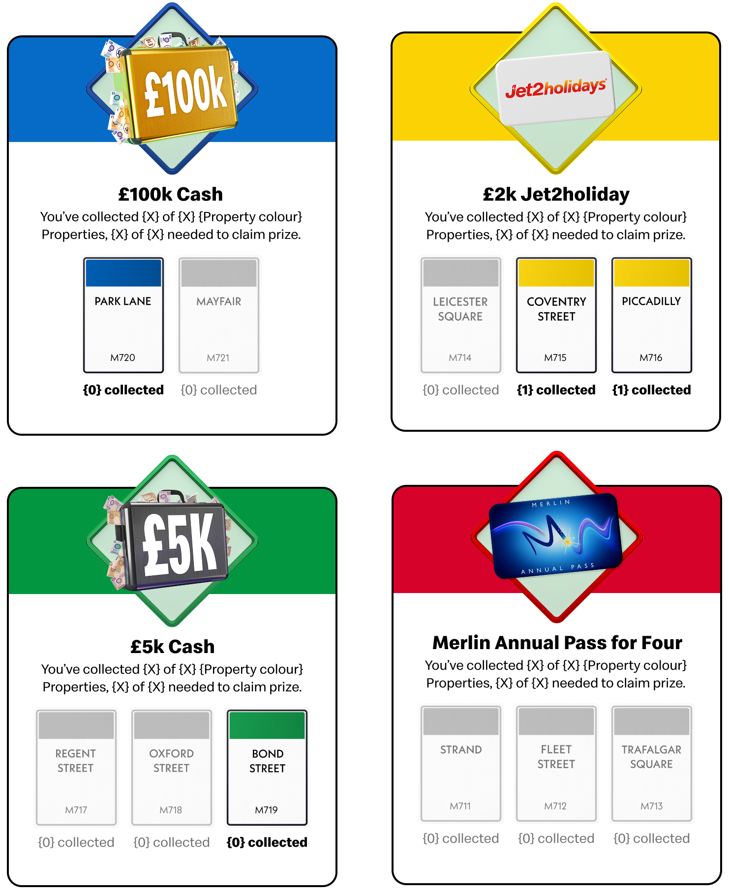
For the property cards, we explored a bunch of approaches before arriving at the final design. Our goal was to create a component that felt rewarding to collect while keeping the information clear. We ultimately landed on a design that gave more focus to the property's prize while displaying the remaining cards needed to complete the set within a single component. This was a major improvement to the information hierarchy as it creates a sense of progression and pushed users to continue collecting.
Hero campaign assets
We also decided to hero the campaign assets. As mentioned, we felt that last year we could have incorporated more campaign elements into the UI to make the app feel more connected to the current year's world and visual aesthetic. To address this, we introduced fun campaign assets within header areas.
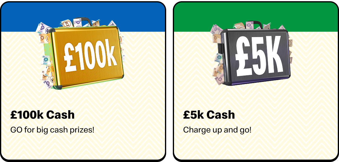
Prize components
Like the property cards, we wanted to reference the iconic Monopoly property cards by incorporating the signature coloured property strip at the top and the information below. To highlights this year's collaboration, we also involed the campaign's graphic pattern into the background to create a distinctive "ultimate collaboration" feel.
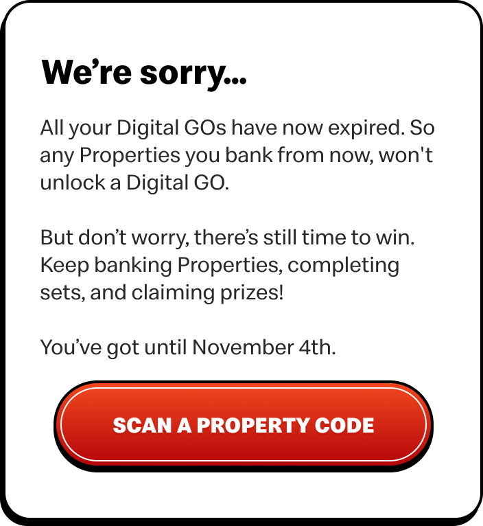
Main Text Cards
We created these reusable card components to add greater depth and visual hierarchy to the interface, with page info being placed in the cards we could reduce the amount of flat text displayed directly on the page and help us achieve our overall goal of having more depth in this campaign. With this change, information became easier to scan & the allowed the UI to have a more modern feel.
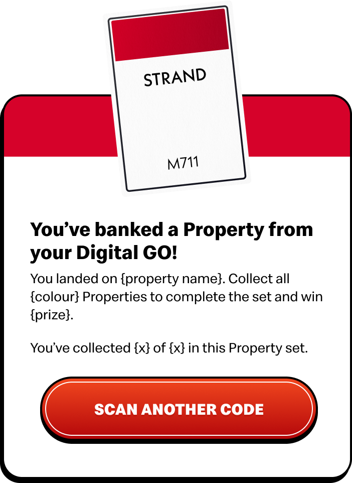
Prize Claim Cards
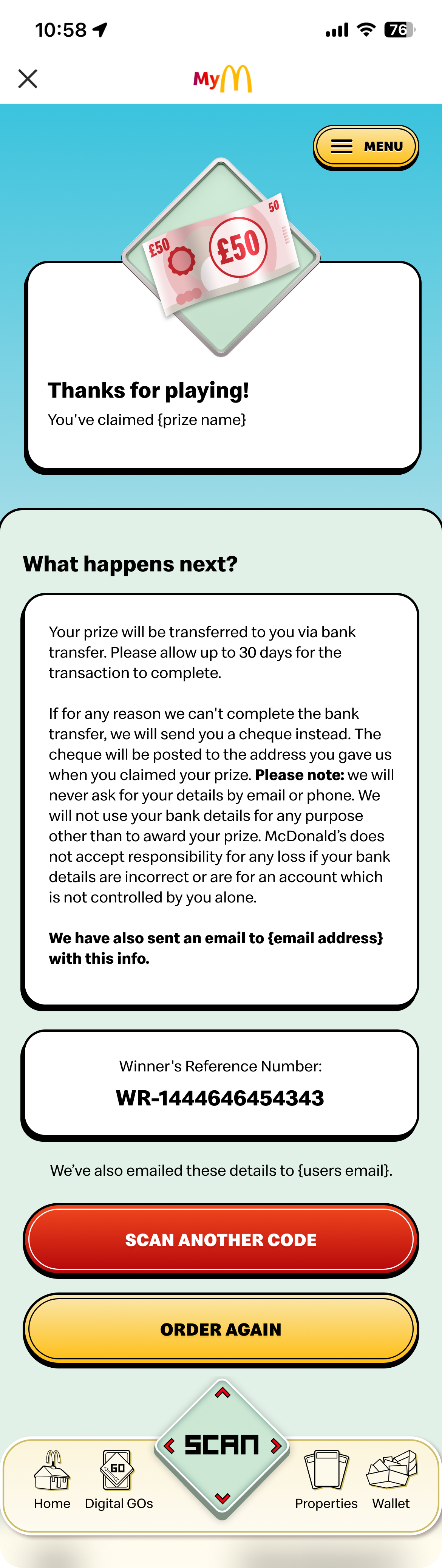
On the Prize Claim pages, we continued using Monopoly inspired card components to communicate when users had banked a property and guide them through claiming their prize. We felt that centering and heroing the property card created a stronger moment of excitement, drawing attention to the reward and making the prize feel more valuable and impactful.
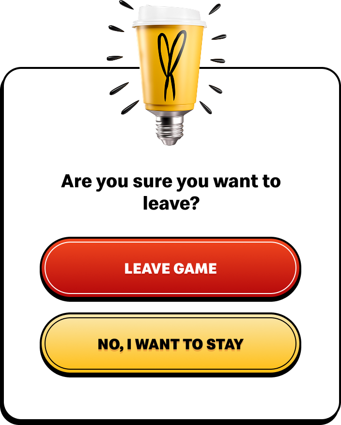
Pop Up Module
For the error and leaving modules, we also made the decision to incorporate campaign assets, such as the coffee cup light bulb shown in this example, to maintain the campaign focused aesthetic and create a more cohesive energy throughout the app.
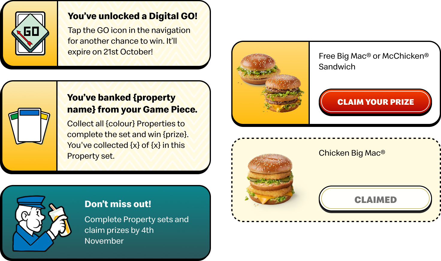
Proporties Cards
For the wallet components, we landed on a approach that complemented the wider UI system. We paired these with icons created by the team, helping to bring more personality into the component and strengthen it with the campaign aesthetic.
Screens
.png)
.png)
.png)
.png)
.png)

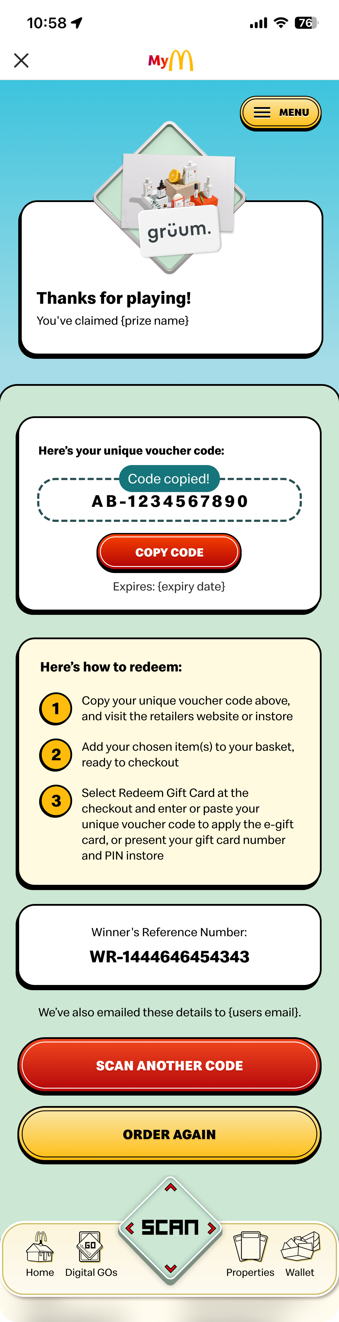
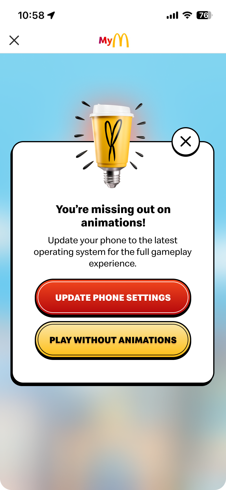



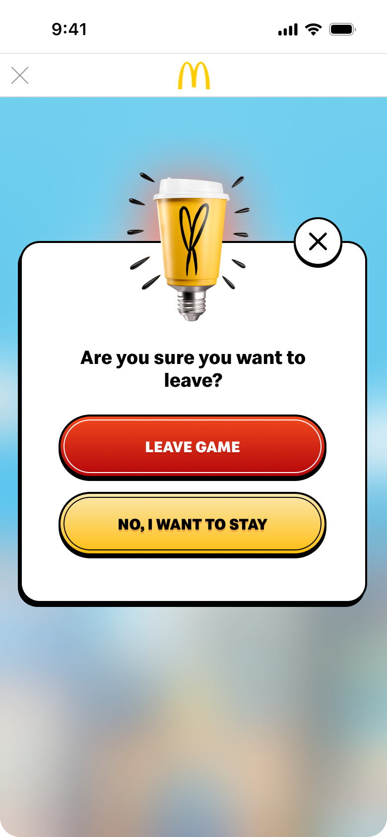
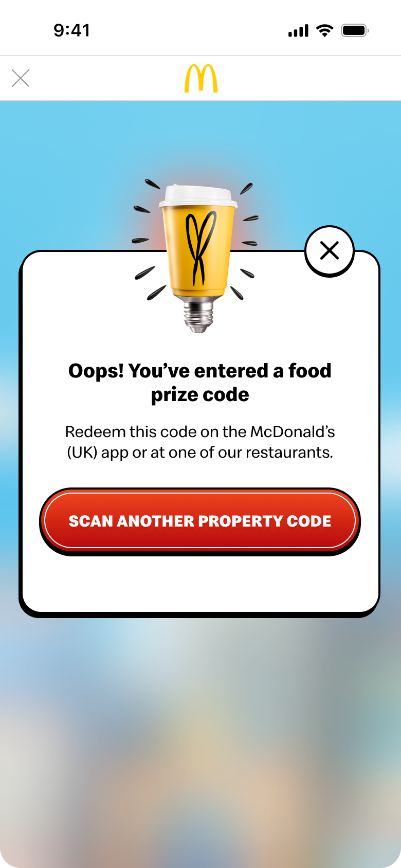
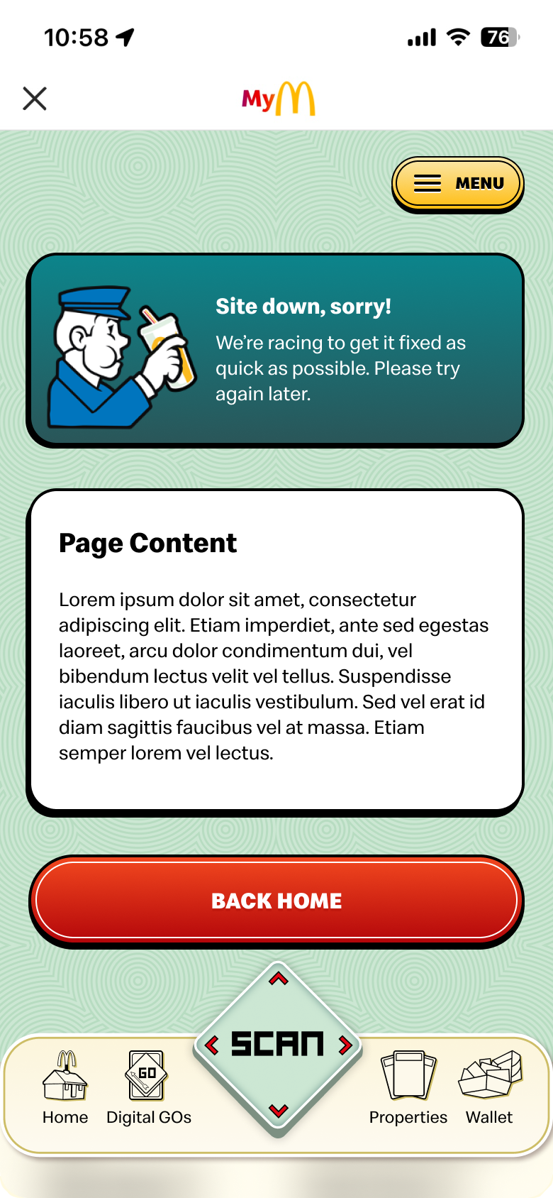
Demo
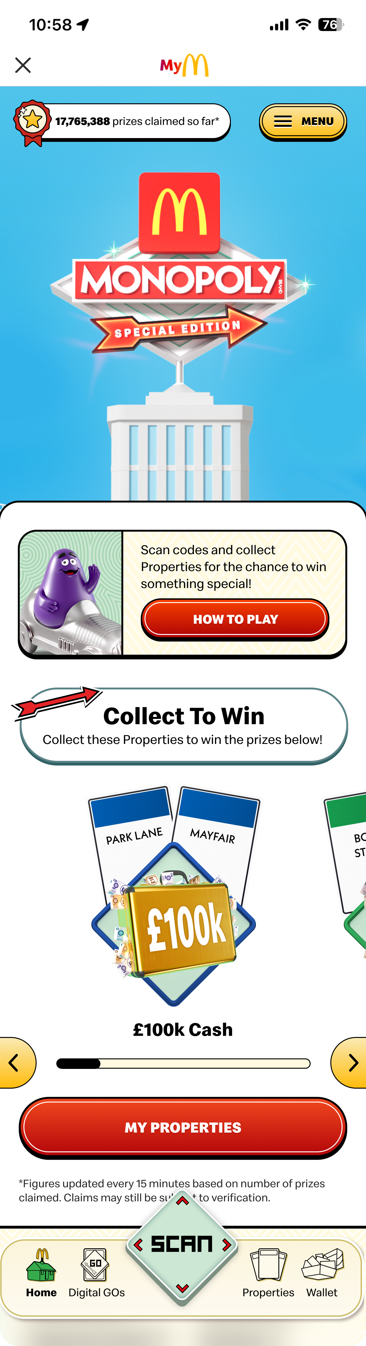
Here is the opening of the Monopoly: SE experience, starting with the age gate and homepage
And the Properties page with an example of the Digital GO experience in action, including the animation that brings the interaction to life.
Testing
%202.png)
Overview
Before the app is launched, we go through a two week testing phase to make sure the designs have been coded as intended and are working to the highest standard. During this time, we work closely with the development team to review the UI, identify and fix any bugs or inconsistencies, and test the overall experience to make sure users can complete key tasks easily and without friction.
Accessibility
Whilst designing we make sure that our buttons and text meets the accesability standards using the the figma plugin Stark which allows us to quickly check the colour contrast of text on it background. This is then checked again during the testing phase to reassure that standards are met before the launch.

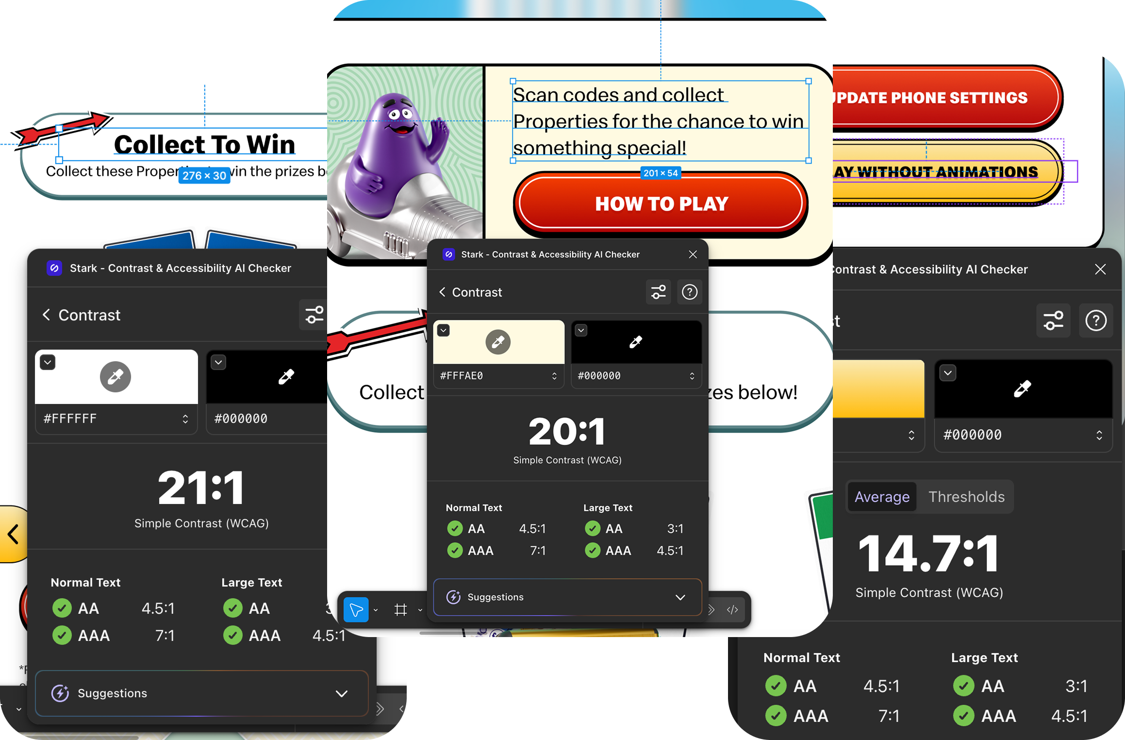
We also made sure our designs met WCAG 2.2 guidelines, this included:
Resizable text: Checking if the text readable and functional when the page is zoomed to 200%. We created a version of our designs in 200% to make sure of this.
Suitable header structure: This creates a clearer reading experience for assistive technology users while making content easier for everyone to scan.
Form labels: Every form input has a label that describes it's needed input.
Designs were functional in both portrait and landscape: So our content is not restricted to only one orientation.
Captions were added as a visual aid: Colour is not used as the sole method of conveying content or distinguishing our visual elements, this helps that that may need a screen reader or are colour blind.
Left aligned our text: Left aligned text is often easier to track because the beginning of each line stays in the same place which is helpful for those who magnify their screen and users with low vision, dyslexia, or cognitive disabilities as it's easier to scan.
Stage App Testing & Jira
Once the developers have implemented our designs, the app is released to the McDonald's Stage environment for testing. At this stage, we carry out a full UI review, as after coding can sometimes introduce inconsistencies or visual issues. Any bugs, design discrepancies, or usability concerns are logged in Jira and worked through collaboratively with the development team before launch.
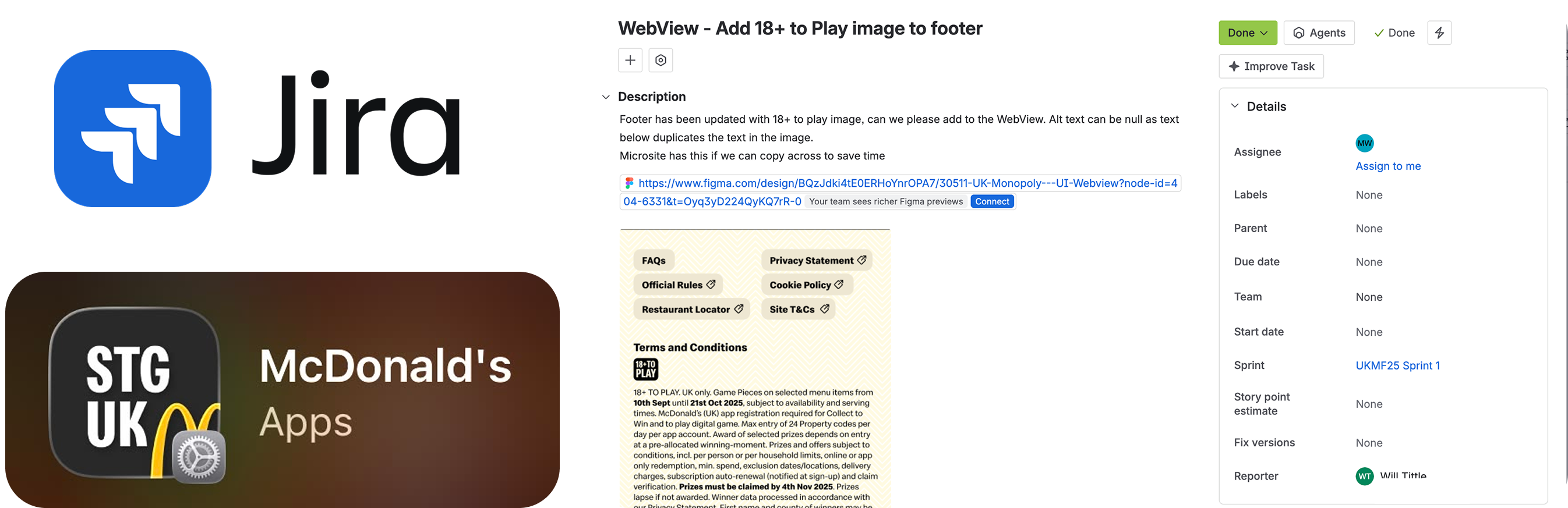
Workshop
We then hosted an internal workshop using an A/B testing exercise, where participants completed a series of tasks across different design variations. This allowed us to compare how each version performed, evaluate whether users could easily find what they were looking for, and identify which design provided the clearest and most intuitive experience. The findings helped validate our design decisions before launch.
Below are the results for the selected final design, demonstrating how users performed across the tested tasks:
1
5
20
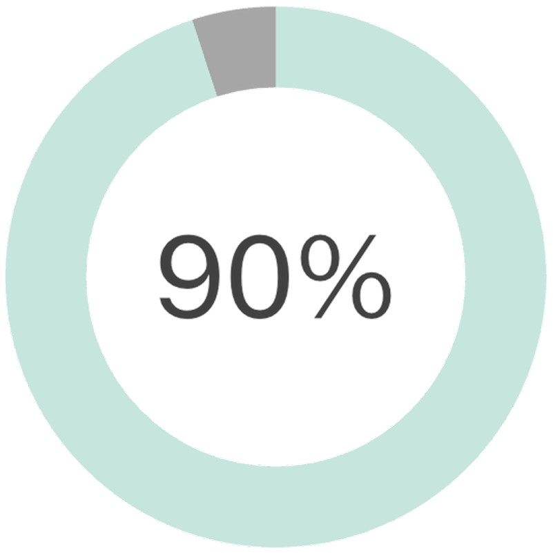
Success Rate Percentage (Completing the task)
The final chosen design achieved 90% success rate. When participants were asked to complete key tasks, such as claiming a prize, most participates were able to do so successfully without assistance. These results confirmed that the chosen design was intuitive & easy to navigate.
Click Through Rate (The percentage of users clicking a specific element like a button or link)
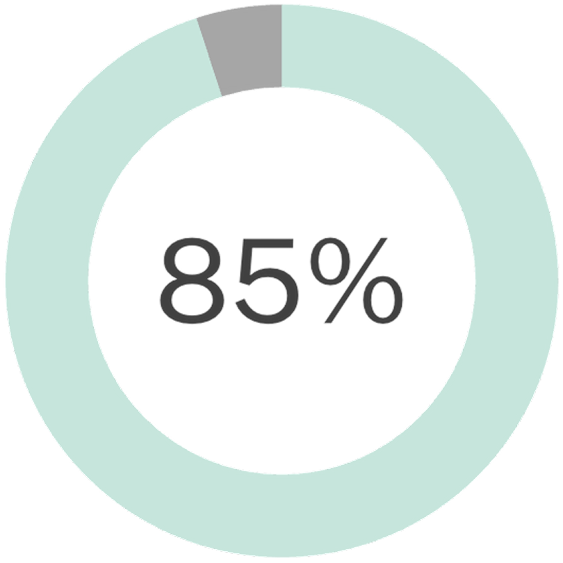
The final design achieved a 85% correct click rate, showing that users could quickly identify the intended actions without confusion. This showed that our button hierarchy, visual emphasis, and page layout helped guided users through key tasks.
The Results

Overview
After launch, the campaign ran for six weeks, from 10 September to 21 October. Based on the results, this became our most successful Monopoly campaign to date, achieving the highest number of users participating and the greatest number of codes entered.
Final Stats
20,870,519
Valid codes entered
+11.3%YOY
3,215,746
Unique players
-4.4%YOY
74,869,116
Digital GOs played
+13.1%YOY
11,421,741
Digital prizes awarded
+9.7%YOY
461,206
Total
completed sets
+19.3% YOY
713,857,414
Total prizes claimed
-4.6%YOY
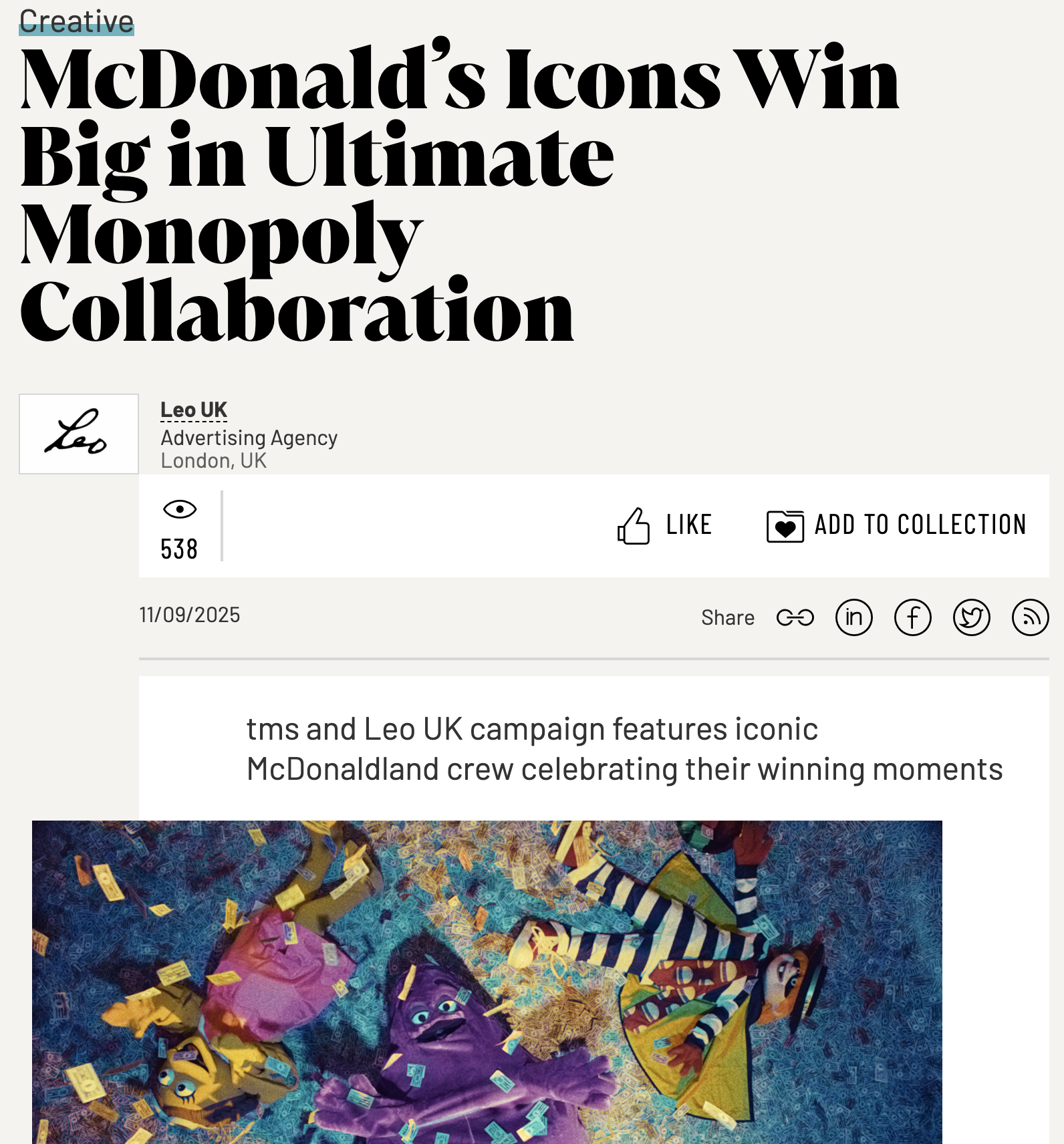
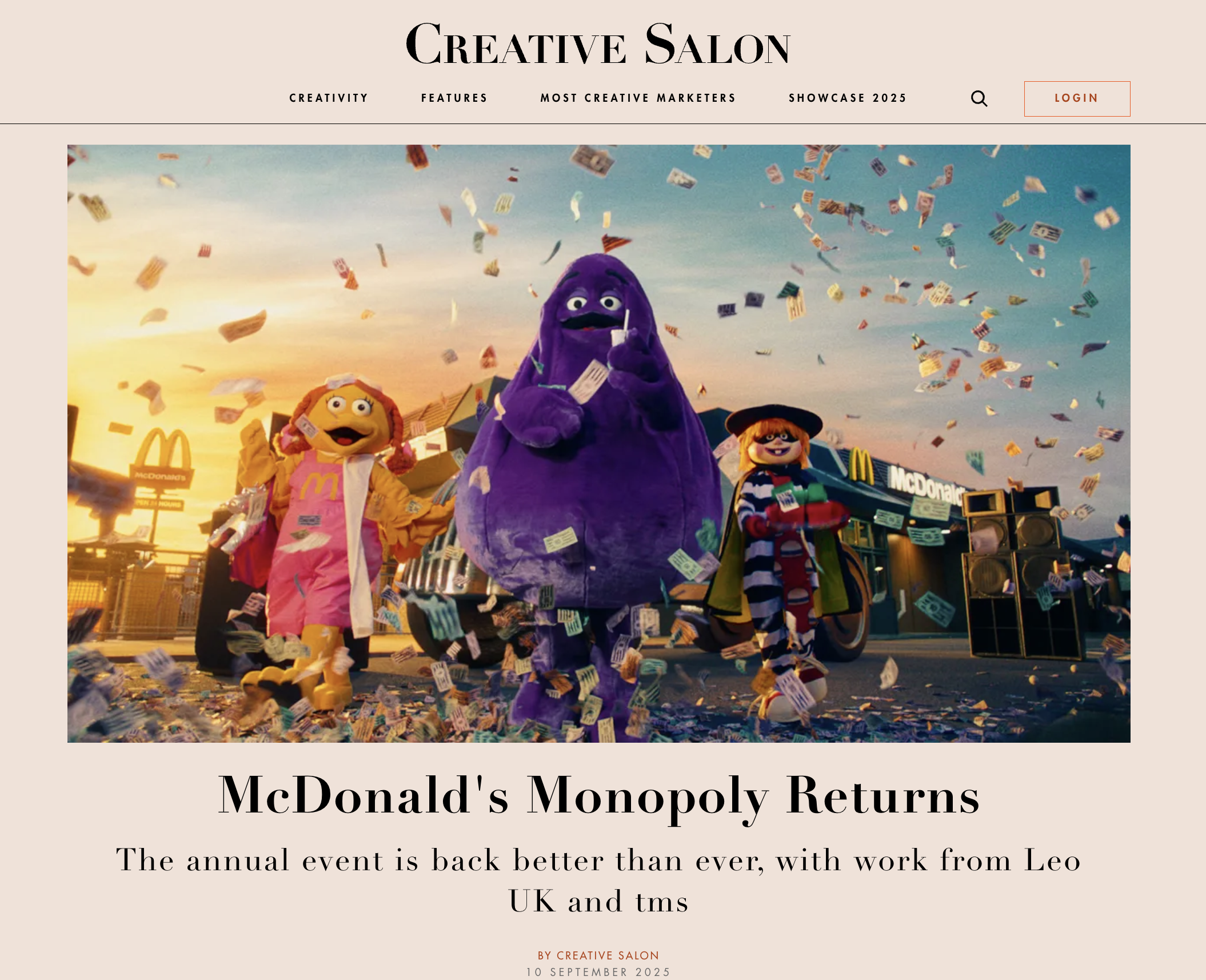
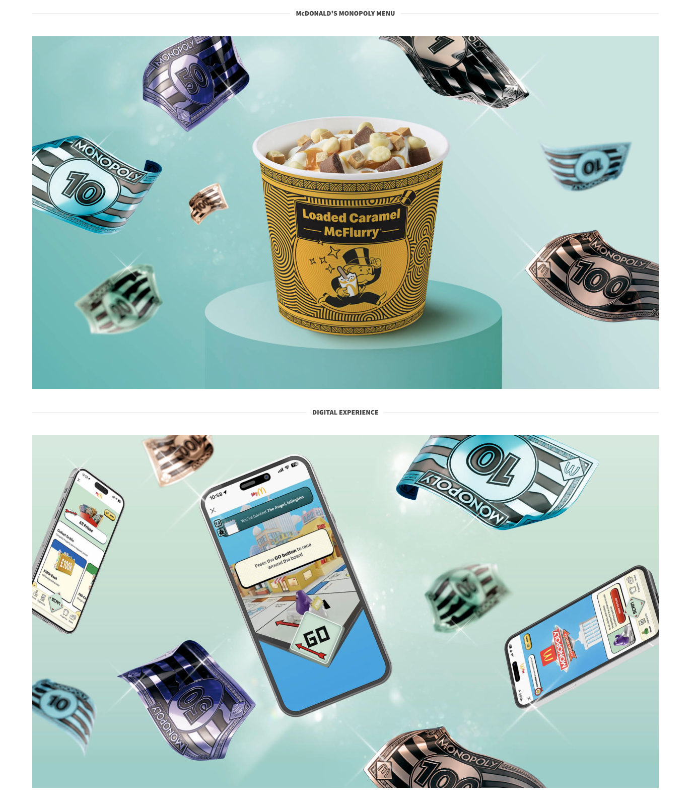
Media and press feedback
McDonald’s Monopoly 2024:
Power Peel
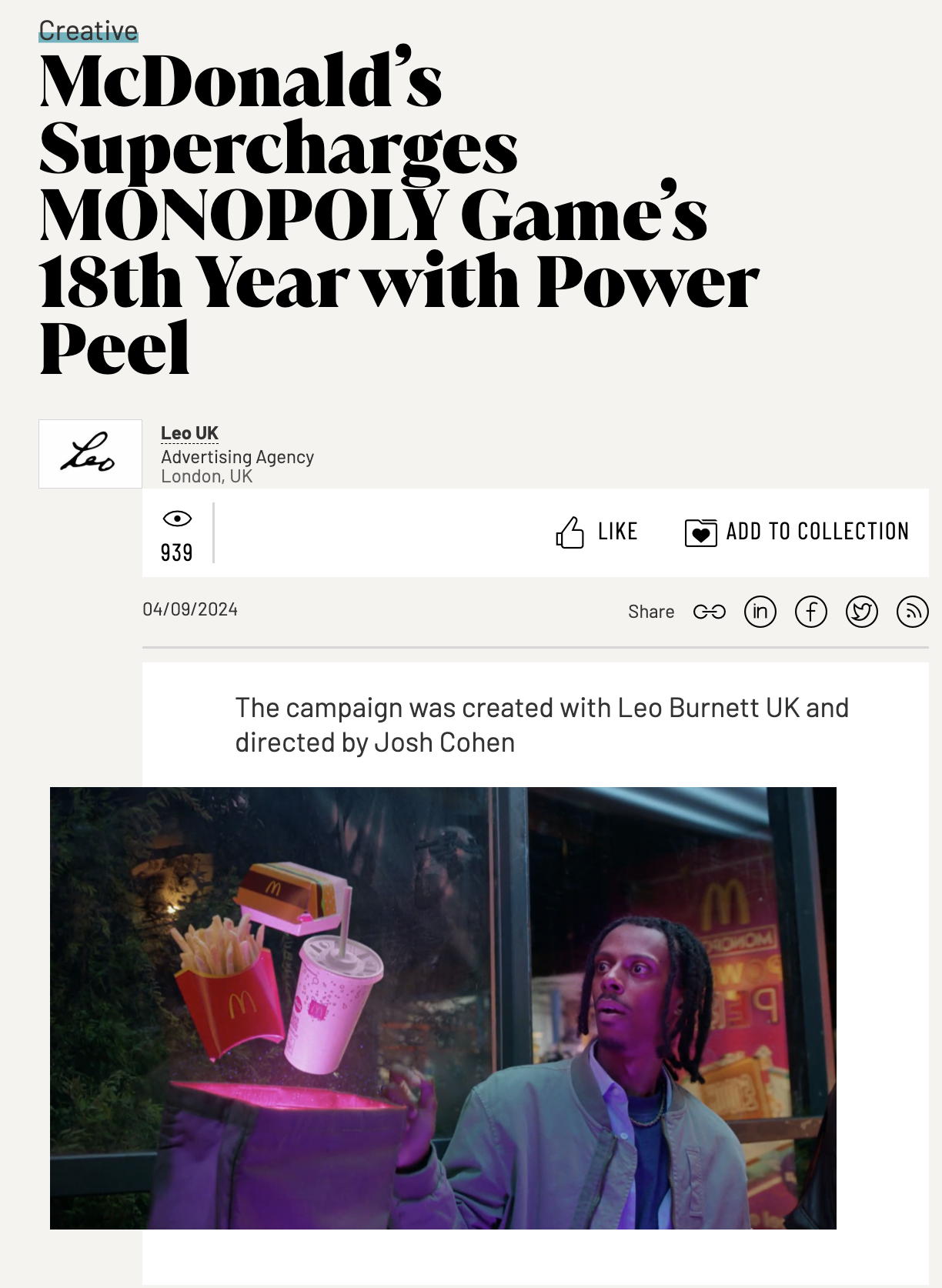
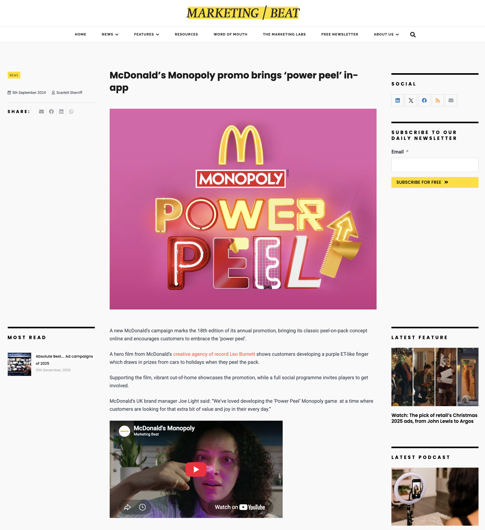
In 2024, the McDonald's Monopoly campaign introduced Power Peel; a bold, energetic, and joyful new creative platform designed to evolve the previous two years of the Double Peel campaign. The concept encouraged customers to "get their game on" by peeling on-pack stickers and making moves in the app, creating a more dynamic and engaging game experience. Inspired by the rise of the "generation side hustle" mindset, the campaign tapped into a growing desire for people to get more out of everyday moments. Power Peel celebrated the excitement and anticipation of every peel, empowering customers to maximise their chances of winning through new game mechanics, enhanced digital features, and a vibrant campaign full of energy, optimism, and reward.
Project Type:
Strategies:
- UI Design
- Prototyping
- Usability Testing
Timeline:
Tools Used:






Introduction
Evaluation
- Core Functionality & Mechanics
Final Product
- Icons & Buttons
- Design & Visual elements
- Screens
Results
- Media and press feedback

%20(2)%20(1).gif)
Introduction

Overview
This was the first McDonald's Monopoly campaign designed by the newly formed in house TMS London Digital team. As a new and ambitious team, we saw it as an opportunity to redefine the digital experience and show how far we could expand the McDonald's Monopoly universe. Everyone was excited to establish a new creative standard, so we began by immersing ourselves in the campaign, gaining a deep understanding of that year's theme, objectives, and overall creative vision before moving into the design process.
McDonald’s Monopoly 2024 : Power Peel
The 2024 McDonald's x Monopoly campaign was a based on a Power Peel concept, encouraging customers to peel on pack stickers and embrace a "hustle for joy" mindset. The creative direction was designed to make the game feel bold, energetic, and impossible to resist, empowering customers to get more out of every peel and every play. Inspired by the idea of a "hustle for joy," the visual language embraced a vibrant neon aesthetic, creating a world that felt energetic and full of excitement. From expressive typography and pulsating frames to glowing peel graphics and bold colours, every element worked together to bring the Power Peel concept to life and immerse users in the campaign.
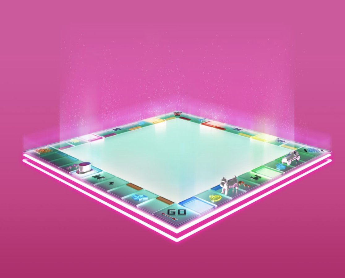
A key visual focus of the campaign was the neon Monopoly gameboard, reimagined with a glowing teal, glass like finish that pulsed with vibrant neon light. The illuminated property colours and iconic Monopoly tokens created a bold, energetic world that became the foundation of the campaign's visual identity.
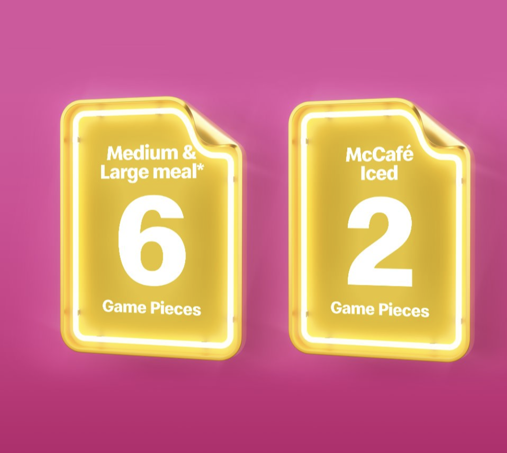
Customer in past campaigns stated they wanted to know how many game pieces each menu item included. In response, this campaign placed a much greater emphasis on clearly communicating the number of game pieces customers would receive with each purchase. To support this, the campaign introduced a dedicated visual asset featuring an elevated neon frame with a 3D Peel, making the information clear &eye catching.
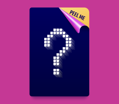
The McDonald's Monopoly Digital Peel returned, giving users the chance to win physical prizes while also earning an additional digital game piece within the app. This extended the excitement of peeling beyond the packaging, bringing the fun and anticipation of Monopoly into the digital experience and creating more opportunities for users to win.
Evaluation

Overview
I had the privilege of working as a Junior UI Designer on this campaign project for McDonald’s. As a UI team, our process typically begins with building knowledge and understanding the context of the year’s theme. So, I’ll start by providing some background on the long-running McDonald’s Monopoly campaign, along with the theme and key features of its 2025 iteration.
Our aims for this campaign
Rather than looking back at previous campaign designs, we set our own ambitions for what we wanted to achieve. As a newly formed team, we wanted to showcase our strengths by pushing the digital experience further than before and creating something fresh, engaging, and memorable that would set a new standard for future McDonald's Monopoly campaigns.
Create an immersive campaign world
We wanted users to open the app and immediately feel immersed in the campaign world as previous campaigns had followed a more repeatable template.
Elevate the digital experience
We wanted to elevate the digital experience by moving beyond a functional app and creating something that felt more interactive and rewarding.
Develop a cohesive design system
We wanted to develop a cohesive design system that brought together the campaign's visual identity, Monopoly brand elements, and digital functionality.
Core Functionality & Mechanics
Below are the core functionality updates for this year's campaign, which formed the foundation for how we approached the UI and overall user experience.
Homepage Gameboard
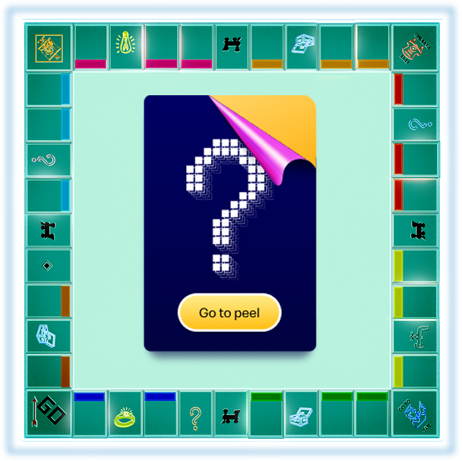
We showed a gameboard on the homepage, allowing users to go to the Digital Peel section while helping them understand their progress at a glance.
Mayfair Mondays
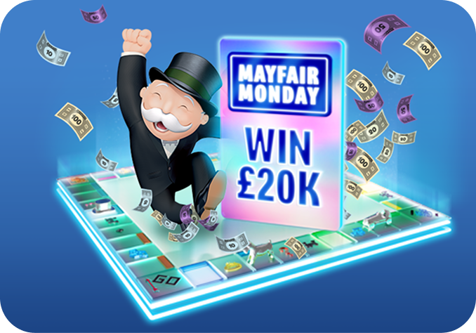
Mayfair Mondays was added which was a exclusive weekly prize draw, giving users a chance to win a £20,000 Mayfair cash prize every monday.
Cash Prizes

We introduced cash prizes into this year's campaign, which required updates to the prize claim journey, including changes to the forms and supporting claim pages.
Bank or Swap
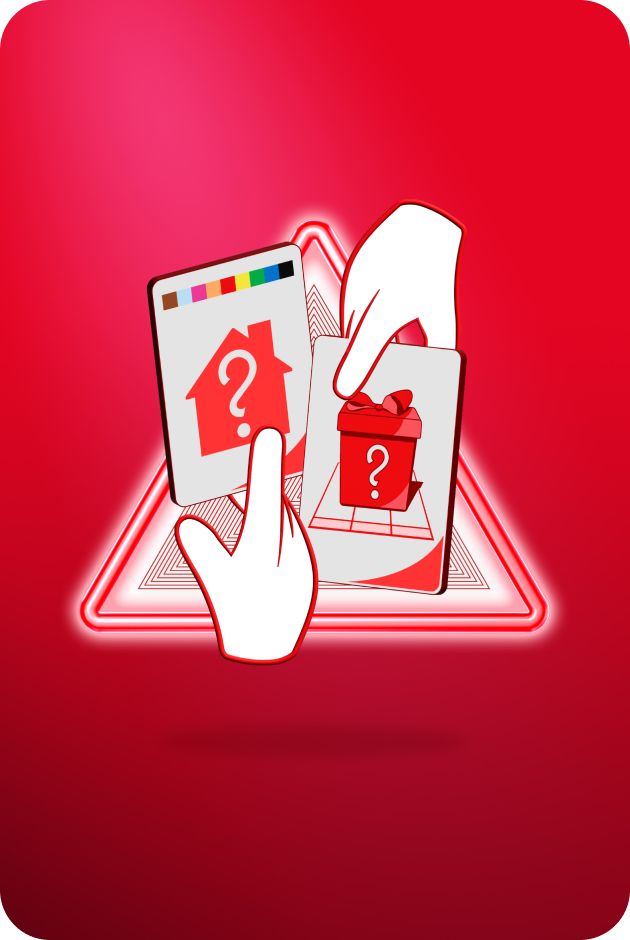
Users could bank their properties or exchange them for an entry into a prize draw of £100k, giving them the choice between collecting a full property set or a chance to win £100k,
The Final Product
Overview
After a two week design phase and our first McDonald's Monopoly design process, we developed the final experience, creating a campaign focused UI with engaging icons, unique visual elements, and motion to bring the campaign world to life.
Colour & Typography

#FFBC0D

#DB0007

#79F2D4

#CCE7D3

#336366

#FCDFEB
Aa
Speedee
Bold
Aa
Speedee
Heading 1 (26 PX)
Heading 2 (20 PX)
Heading 3 (16 PX)
Paragraph 1 (16 PX)
Paragraph 2 (14 PX)
Paragraph 3 (12 PX)
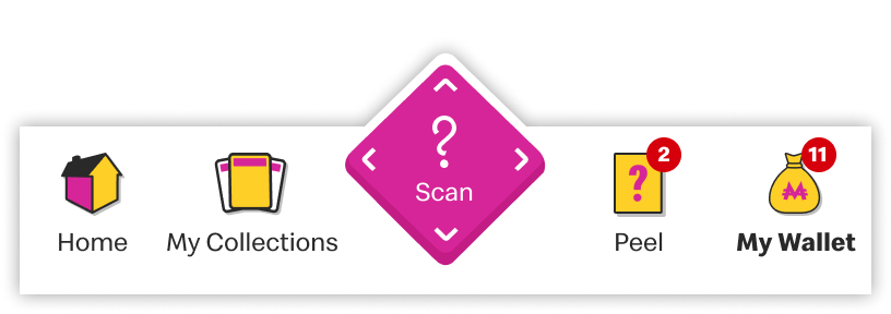
Icons & Buttons
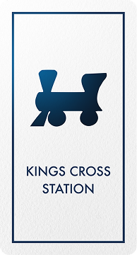
Station Card
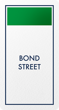
Property Card

Draw Card

Property Bank

Error

On Toggle

Off Toggle

Unlock more

Peel on pack

Game in app

Back to top

Prizes
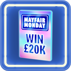
Prize 2.0

Alert

Arrow

Scan

Home

My Collection

Peel

My Wallet






Design & Visual elements
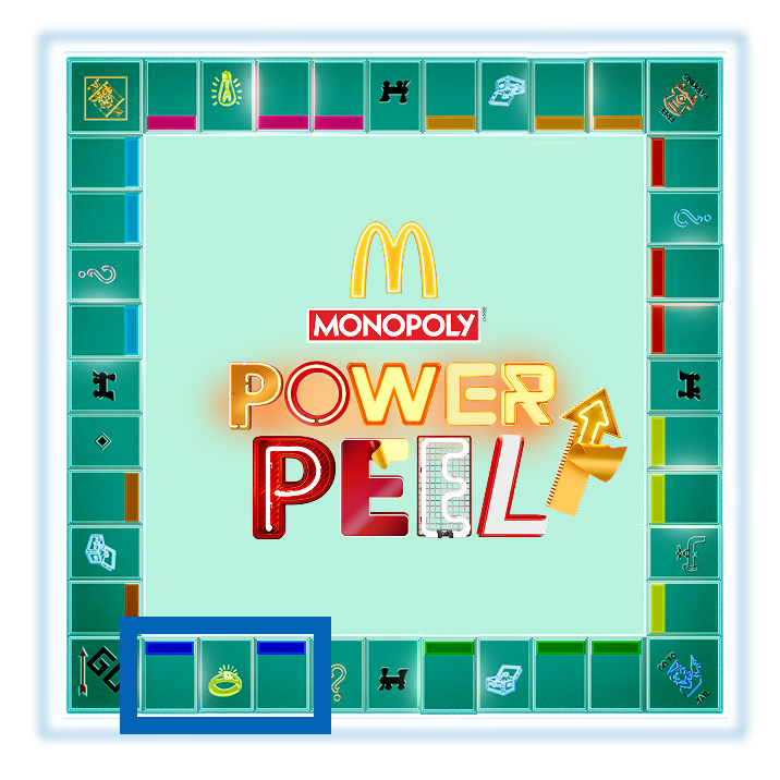
Homepage Gameboard
We introduced the gameboard as the homepage hero, allowing users to track their progress at a glance while encouraging them to visit the Digital Peel section and continue playing.
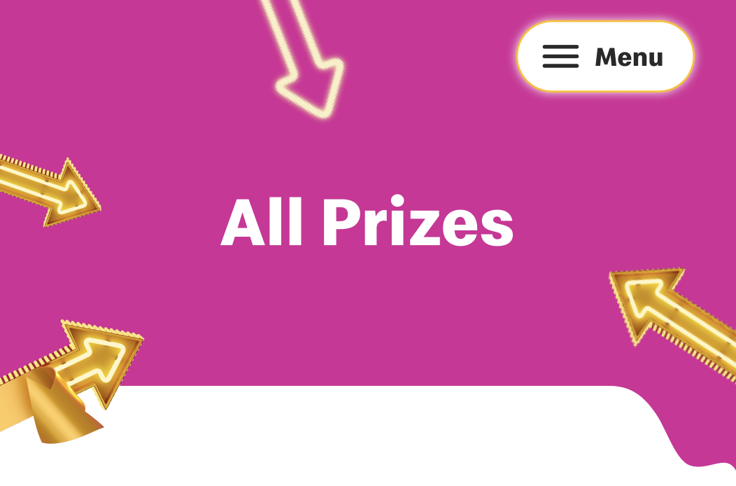
Campaign Themed Headers
We created Power Peel inspired headers using the campaign's arrows, bold vectors, and graphic shapes to create campaign focused visual identity that reinforced the overall neon creative direction.
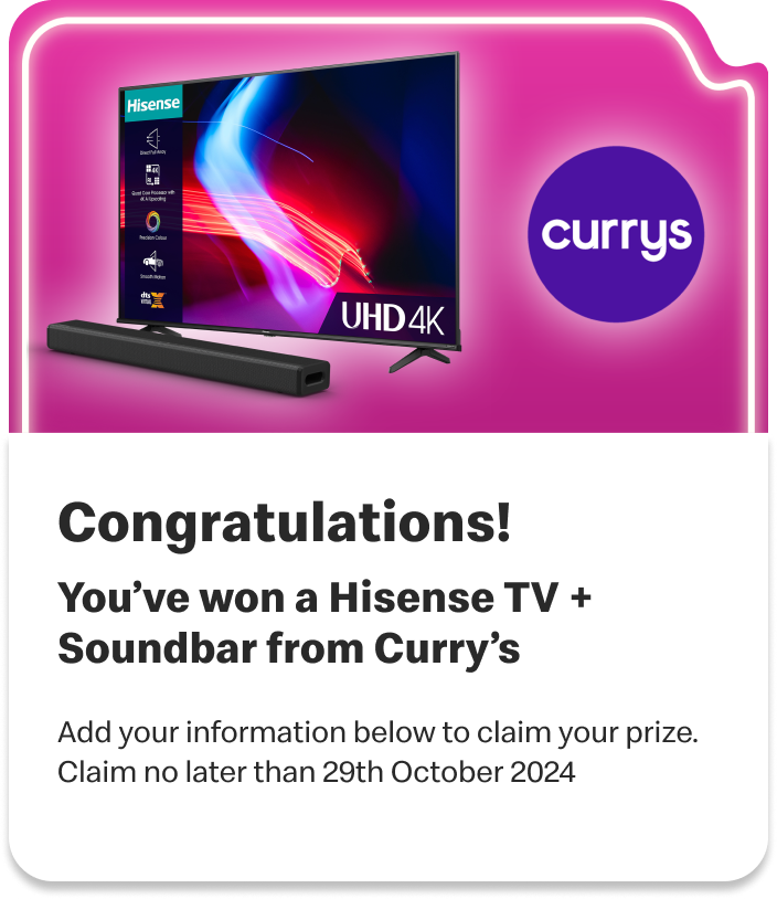
Prize components
We incorporated the Power Peel shapes into the prize components, creating a more dynamic and visually engaging design that reinforced the campaign identity while making prize moments feel more exciting and rewarding.
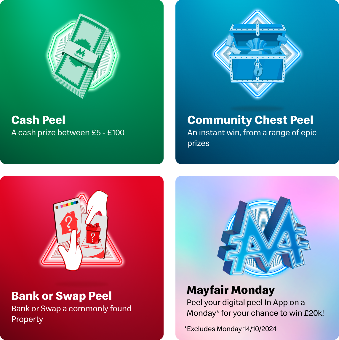
Assets promoting campaign features
We also created a set of promotional cards and displayed them in a carousel to highlight this year's new features. This gave users an engaging way to discover what's new while encouraging exploration throughout the app.
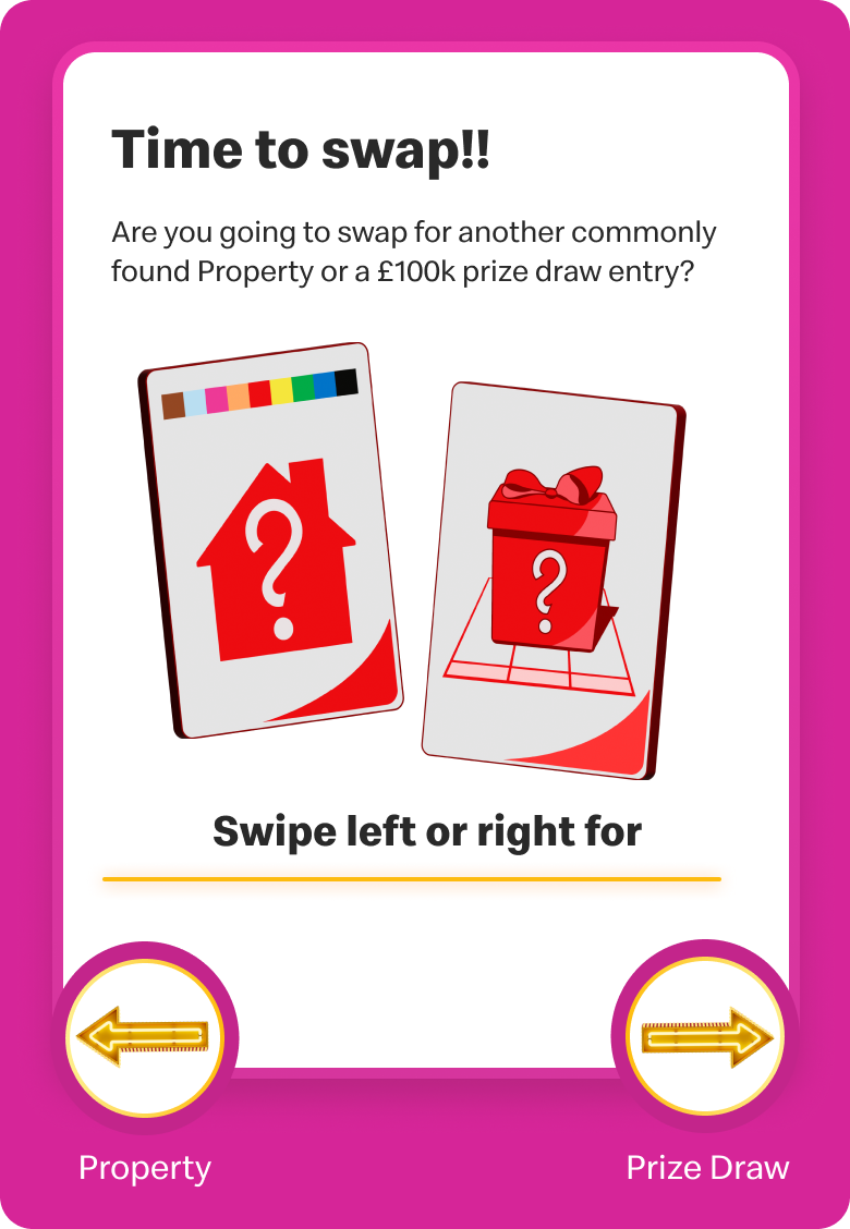
Bank or Swap
I led the design of these cards for the Bank or Swap pages, involving the campaign's arrow graphics to create a more engaging decision making experience. Rather than presenting users with a simple two button choice, we designed interactive cards that made the selection feel more rewarding and game like.
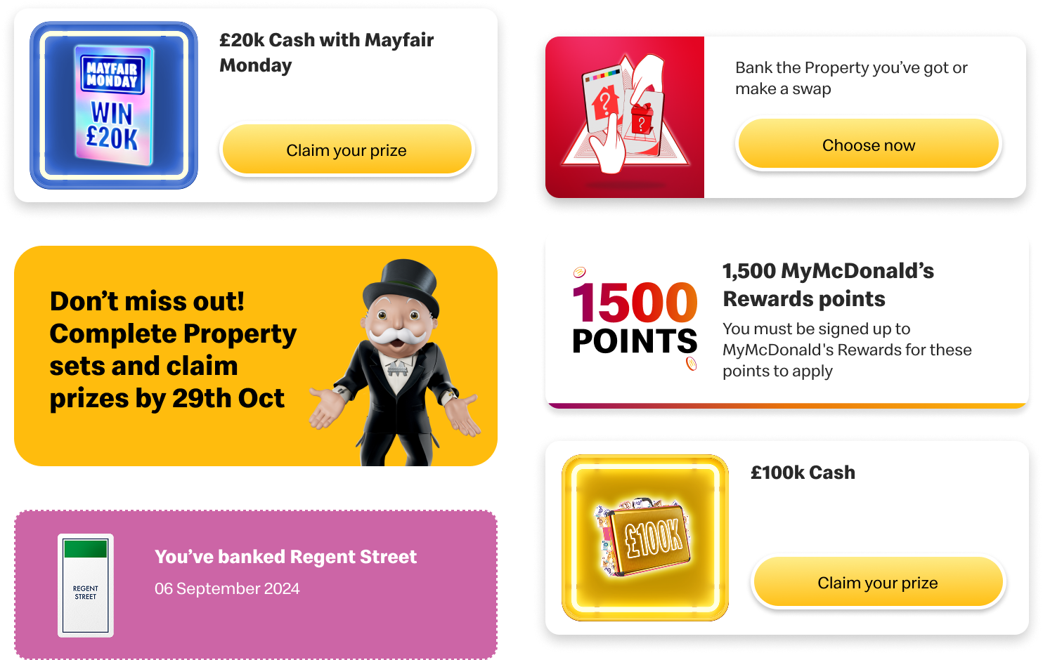
Wallet components
We created a variety of wallet components for prize claims, banked properties, bonus rewards, and prize alerts, incorporating campaign assets to create a more cohensive wallet experience. By using our custom prize visuals and Power Peel elements, we ensured each interaction felt connected to the wider campaign world.
Screens
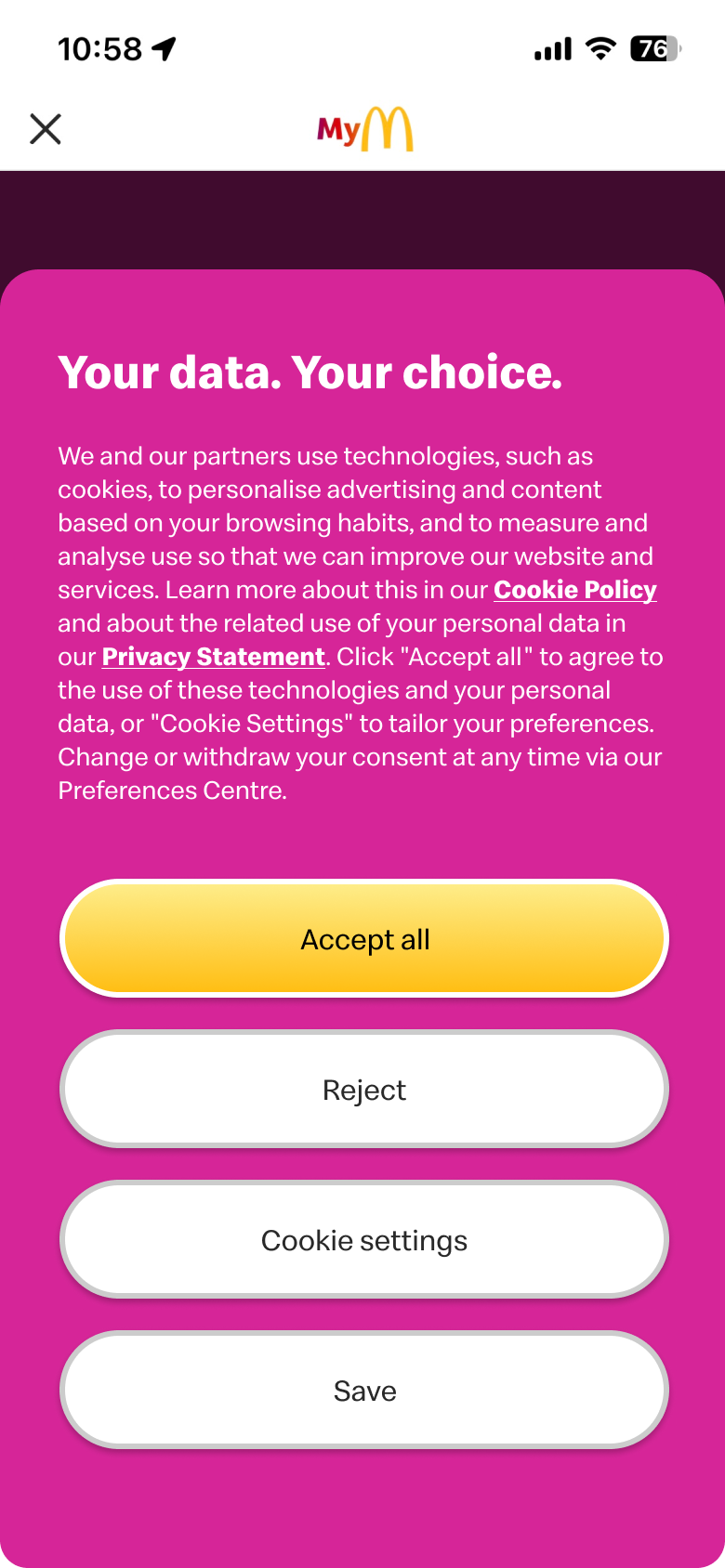
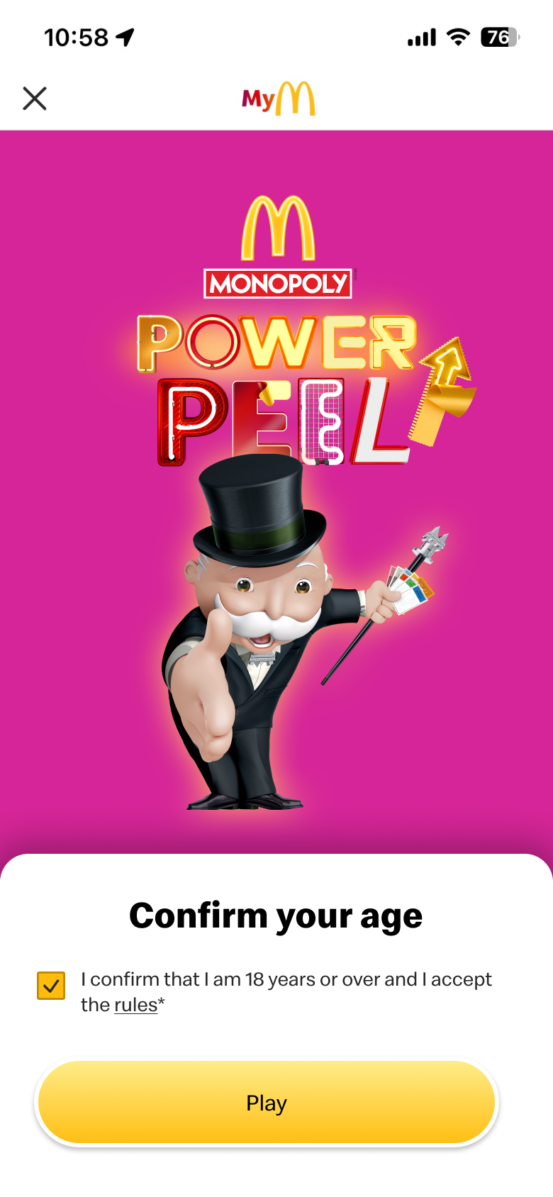

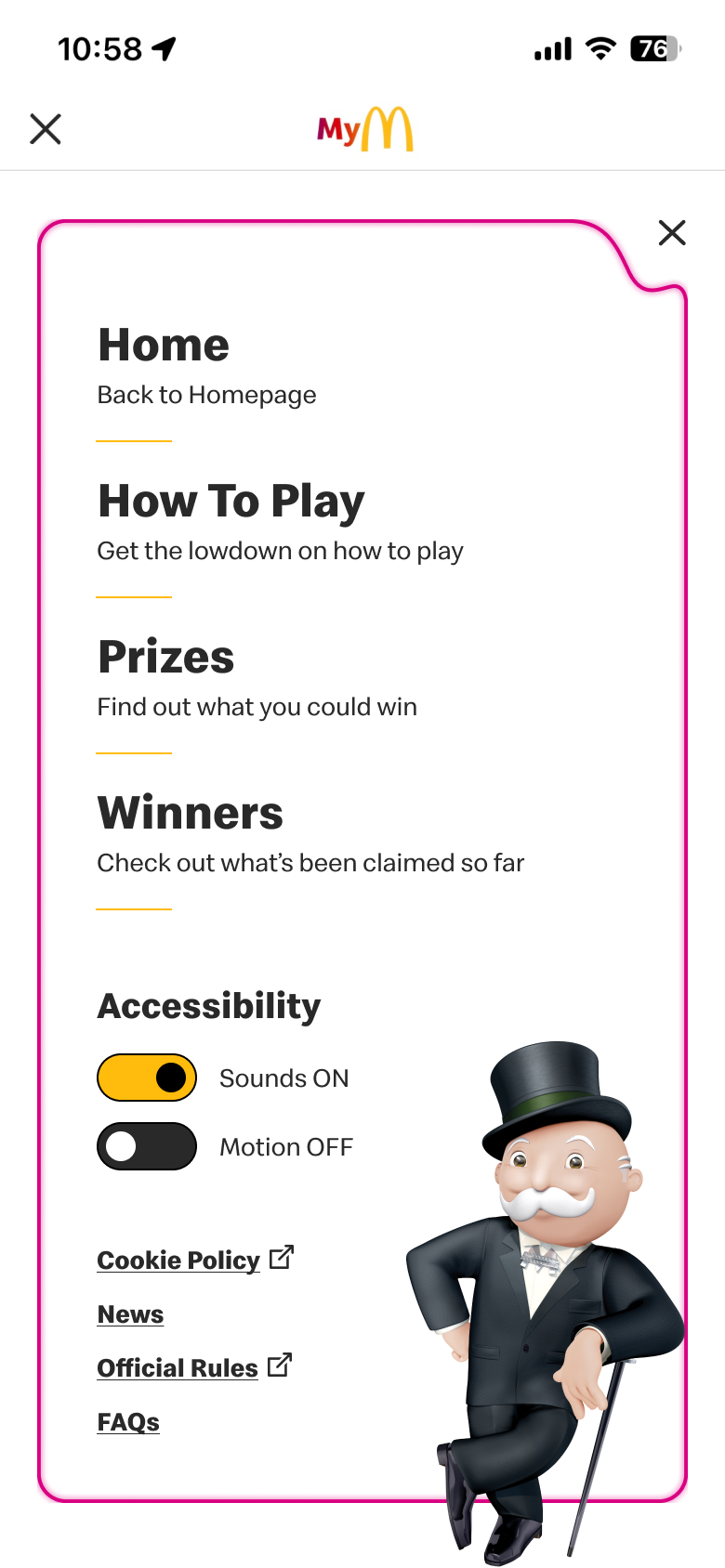




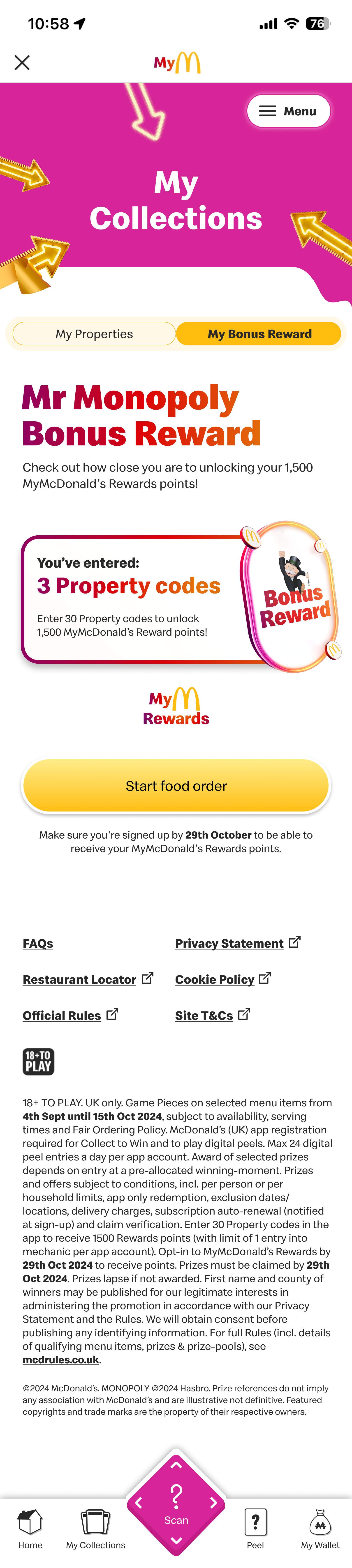



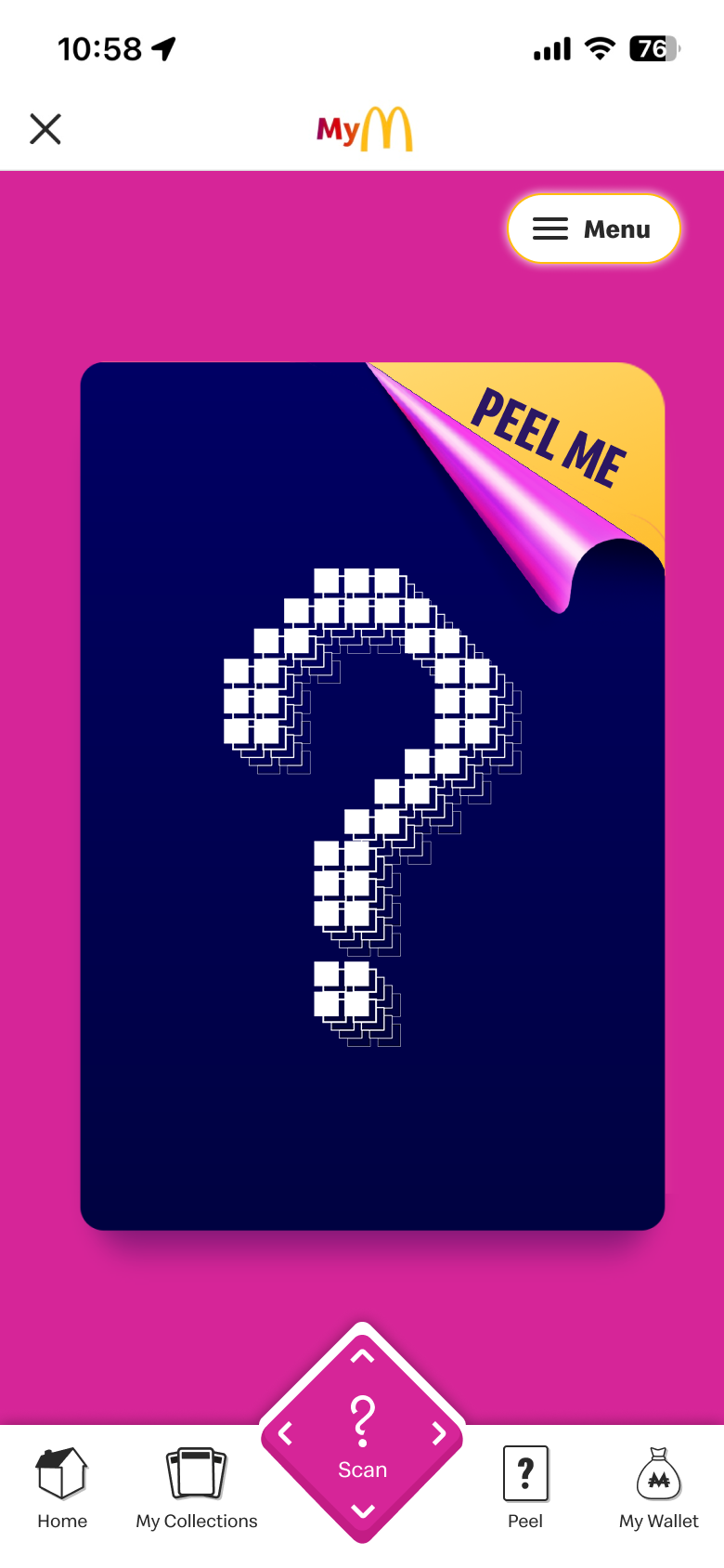


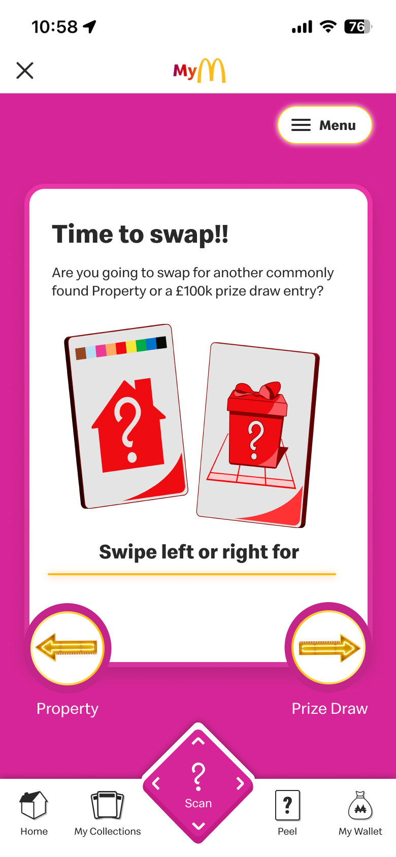
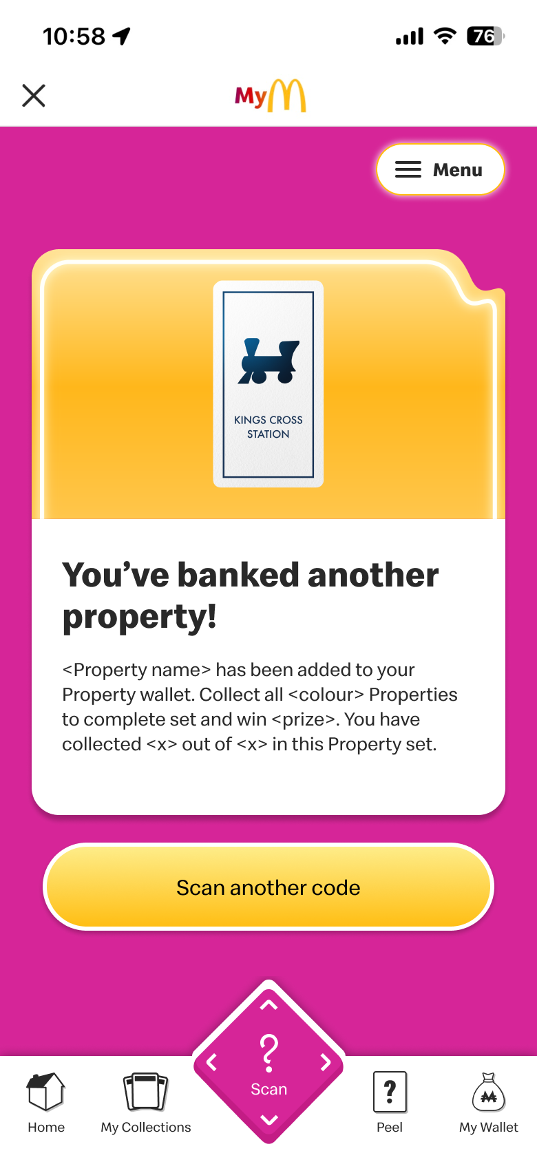


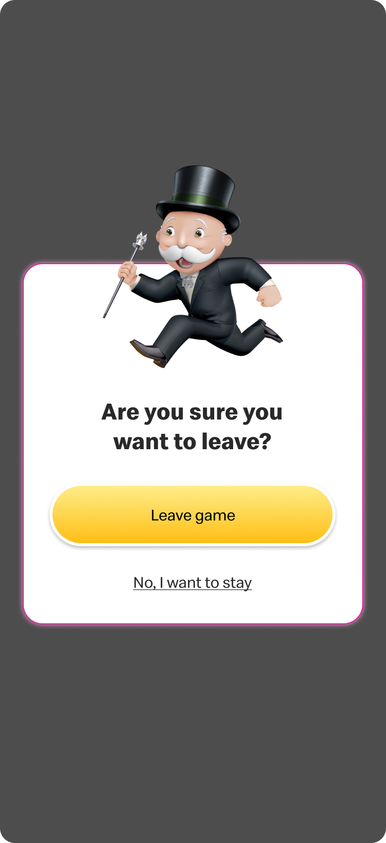
Results

Overview
After launch, the campaign ran for six weeks, from 10 September to 21 October. Based on the results, this became our most successful Monopoly campaign to date, achieving the highest number of users participating and the greatest number of codes entered.
Final Stats
2,946,985
Valid codes entered
+2.1%YOY
953,886
Unique Players
+2.4%YOY
116,200
Registered Users
+10.7%YOY
202,000
Downloads
+18.7% YOY
482,000
Active Users
+3.5% YOY
150,493,404
Total prizes claimed
-4.6%YOY
Media and press feedback
Let's Connect:


Interested in learning more?
Shoot me an email at Shardaidawkins@gmail.com if you want to chat about my work, design knowledge or anything related. Or, get to know me better through my other platforms.